Towny – Real Estate & Construction Logo Design
🏡 🔨 Towny Real Estate & Construction Logo Design
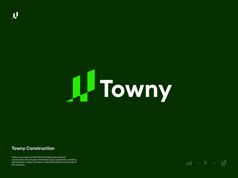
Welcome to the visual identity of Towny – a fusion of real estate sophistication and construction prowess. Our logo encapsulates the essence of quality, reliability, and architectural finesse. Let’s unravel the elements that make Towny’s logo a symbol of excellence in the realms of real estate and construction.
🏠 Iconography – The House Silhouette
The central element of Towny’s logo is a sleek and modern house silhouette, representing the core of real estate. The lines are clean, conveying a sense of contemporary design. This icon stands as a visual testament to the quality homes Towny builds and sells.
🔨 Incorporating the Construction Hammer
Elegantly integrated into the logo is a subtle construction hammer, denoting Towny’s expertise in the construction industry. This dual symbolism reinforces Towny’s comprehensive approach to real estate, from conception to construction.
🎨 Color Palette – Earthy Tones and Blues
The color palette is carefully chosen to reflect the grounded and trustworthy nature of Towny. Earthy tones such as warm browns and sandy beige evoke a sense of reliability, while shades of blue signify professionalism and stability.
🏢 Typography – Modern and Timeless Font
The typography used in the logo is modern and clean, radiating a sense of timelessness. The sleek lines and precise spacing enhance legibility, ensuring that the brand name, “Towny,” is both memorable and professional.
🌐 Integration of Geometric Elements
Geometric shapes, particularly squares, are subtly incorporated to convey precision and structure. This design element reinforces Towny’s commitment to architectural integrity and attention to detail.
🏗️ Dynamic Lines – Progress and Innovation
Dynamic lines within the logo symbolize progress and innovation, suggesting Towny’s forward-thinking approach in the real estate and construction sectors. The lines create a sense of movement, signifying the company’s continuous evolution and adaptation to industry trends.
🌟 Subtle Roof Detailing – Craftsmanship
A subtle detailing of a roof within the house silhouette signifies Towny’s commitment to craftsmanship. It subtly alludes to the quality and attention to detail that the company brings to every project.
🔄 Circular Unity – Seamless Integration
The circular border around the logo elements symbolizes unity and completeness. It reinforces the idea that Towny seamlessly integrates all aspects of real estate and construction, offering clients a holistic and comprehensive service.
In conclusion, Towny’s Real Estate & Construction Logo Design is a visual embodiment of the company’s values, showcasing a perfect balance of modernity, reliability, and innovation. Through a thoughtfully curated combination of iconography, color palette, typography, geometric elements, and dynamic lines, the logo stands as a beacon of excellence in the competitive landscape of real estate and construction. 🏡 🔨
— — — — — — — — — —
Want to collaborate? Email Us: hello@keitoto.com


