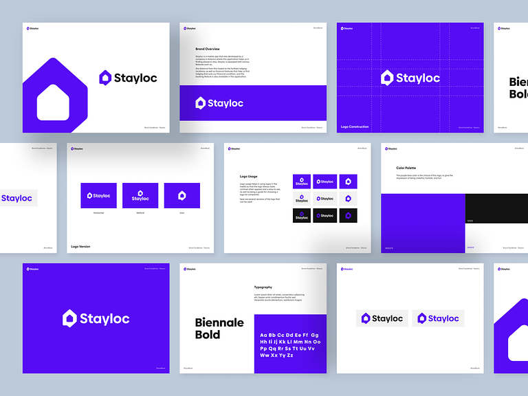
Stayloc – Mobile Apps Logo Design 📱✨
Welcome to Stayloc, where innovative travel meets seamless exploration. The Stayloc mobile app logo is a visual representation of modernity, travel, and a user-friendly experience. Let’s dive into the design elements that make the Stayloc logo stand out.
🗺️ Iconic Map Pin Integration
At the heart of the Stayloc logo is an iconic map pin, symbolizing location and travel. The pin is stylized with a unique twist, embodying the app’s commitment to providing users with precise and personalized location-based experiences.
🌐 Dynamic and Gradient Colors
Stayloc embraces a dynamic color palette, seamlessly transitioning from vibrant blues to energetic greens. The gradient colors not only evoke a sense of adventure but also represent the diverse destinations and experiences that users can explore through the app.
🏡 Contemporary Typography
The word “Stayloc” is crafted in a contemporary and clean typeface, balancing readability with a touch of sophistication. The modern typography communicates the app’s commitment to delivering a cutting-edge and user-centric travel experience.
👁🗨 Uniquely Crafted Letter “S”
The letter “S” in Stayloc is uniquely crafted to resemble a winding road, symbolizing the journey and exploration aspect of travel. This creative touch adds a memorable and distinctive element to the logo, making it instantly recognizable.
🔄 Circular Composition
The logo adopts a circular composition, representing unity, continuity, and the cyclical nature of travel experiences. The circular design also reinforces the idea that Stayloc is an all-encompassing solution for travelers, offering a complete and seamless experience.
📱 Mobile App Integration
A subtle integration of a mobile device within the logo emphasizes Stayloc’s status as a mobile app. This element reinforces the app’s accessibility, suggesting that users can carry their travel experiences in the palm of their hands.
✨ Overall Aesthetic Appeal
The Stayloc logo is designed to be visually appealing and memorable. The combination of modern design elements, vibrant colors, and thoughtful symbolism creates a logo that resonates with users, inviting them to embark on exciting journeys with the app.
In conclusion, the Stayloc – Mobile Apps Logo Design encapsulates the essence of modern travel, user-centricity, and seamless exploration. As users engage with the app, the logo serves as a beacon, guiding them towards a world of exciting and personalized travel experiences. 🌍🧳✈️
— — — — — — — — — —
Want to collaborate? Email Us: hello@keitoto.com


