Checup – beverage company logo branding
🍹 Checup – Beverage Company Logo Branding 🌟🥤
Welcome to Checup, where refreshing moments and delightful sips come together in a symphony of flavor. The Checup logo branding is meticulously crafted to capture the essence of joy, vibrancy, and the diverse range of beverages offered by the brand. Let’s dive into the elements that make the Checup logo a standout in the world of beverage branding.
🌈 Color Palette
Checup’s color palette is a celebration of vibrancy and freshness. The logo incorporates a playful mix of lively colors, from citrusy yellows to cool blues and greens. These colors not only evoke a sense of excitement but also reflect the diverse range of beverages that Checup brings to its customers.
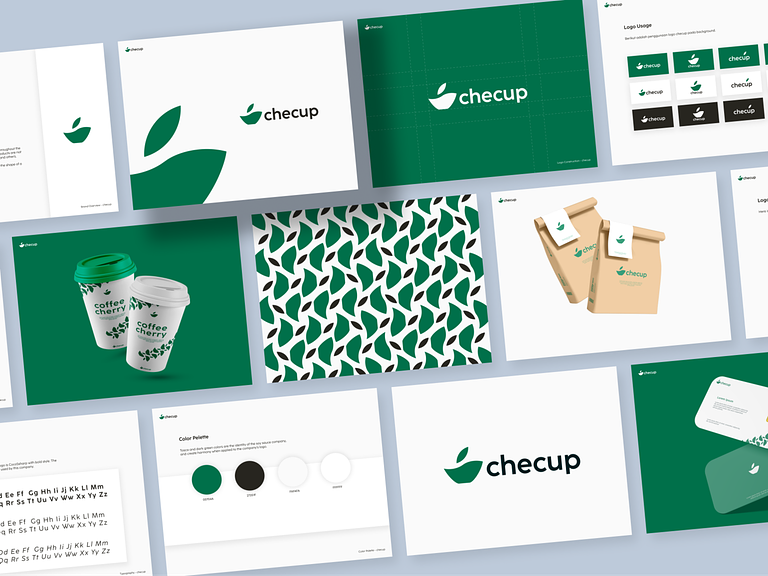
🥤 Dynamic Cup Icon
At the heart of the logo is a dynamic cup icon, creatively designed to symbolize the versatility of Checup’s beverage offerings. The cup is stylized with fluid lines and curves, conveying the idea of a delightful pour and a diverse menu of drinks to explore.
🎨 Versatile Typography
The brand name “Checup” is presented in a versatile and modern typeface. The typography balances readability with a touch of playfulness, reinforcing the brand’s identity as a contemporary and exciting beverage company. The letters are carefully spaced for a harmonious composition.
🌟 Iconic Straw Detail
To add a distinctive touch, an iconic straw detail is incorporated into the cup icon. The straw signifies the act of sipping and enjoying the beverage, creating a memorable visual element that reinforces the brand’s commitment to delightful moments and experiences.
✨ Whimsical Accents
Whimsical accents, such as bubbles or splashes, surround the cup icon to convey the effervescence and excitement associated with enjoying Checup beverages. These details add a touch of whimsy to the logo, creating a sense of joy and anticipation.
🌍 Brand Consistency in Monochrome
Checup’s logo is designed to maintain its impact even in monochrome. Whether in black and white or vibrant color, the logo retains its clarity and brand consistency, ensuring recognizability across various applications, from packaging to digital platforms.
🌟 Timeless Aesthetic
The Checup logo is crafted with a timeless aesthetic that transcends trends. It captures the essence of a brand that brings joy and refreshment to its customers, standing the test of time in a dynamic and ever-evolving market.
In conclusion, the Checup Beverage Company Logo Branding is a visual symphony that resonates with the joy of sipping refreshing beverages. With a vibrant color palette, a dynamic cup icon, and whimsical details, the logo encapsulates the spirit of Checup – a brand that transforms ordinary sips into extraordinary moments. 🍹🌟
— — — — — — — — — —
Want to collaborate? Email Us: hello@keitoto.com


