Noua – Juice Drink Company Logo Branding
🍹 Noua – Sip Fresh, Feel Fresh! Juice Drink Company Logo Branding 🌿🌈
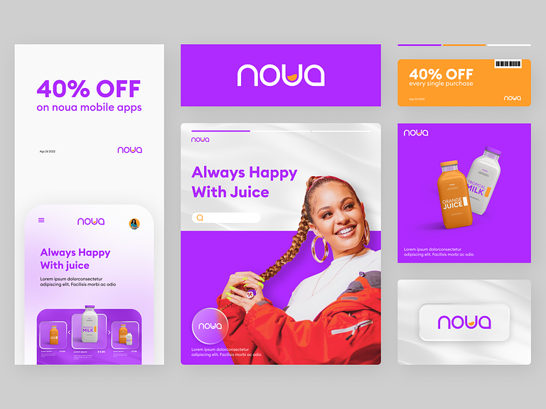
Step into the vibrant world of Noua, where every sip is a celebration of freshness and flavor. Noua’s Juice Drink Company Logo Branding captures the essence of the brand—refreshing, lively, and a burst of natural goodness. Let’s explore the key elements that make Noua’s logo a symbol of invigorating juice experiences.
🌱 Nature-Inspired Emblem
Noua’s logo features a nature-inspired emblem at its core. A stylized leaf or fruit element takes center stage, symbolizing the brand’s commitment to using fresh and natural ingredients. The emblem is crafted with fluid lines, radiating a sense of energy and vitality.
🌈 Vibrant Color Palette
Noua embraces a vibrant and diverse color palette inspired by the hues of fresh fruits and botanicals. Each color represents a different flavor variant, creating a visually appealing spectrum that evokes the richness and variety of Noua’s juice offerings.
🌟 Dynamic Typography
The brand name “Noua” is presented in dynamic and modern typography. The letterforms are fluid, reflecting the natural flow of liquids, while maintaining a clean and legible appearance. The choice of typography adds a contemporary touch to Noua’s identity.
🔶 Minimalistic and Versatile Design
Noua’s logo adopts a minimalistic approach, focusing on essential elements that convey the brand’s core values. The design is versatile, ensuring that the logo maintains its clarity and impact across various applications, from product packaging to digital platforms.
💧 Freshness Droplets
Integrate subtle droplet elements into the logo to evoke the imagery of freshness. These droplets can surround the emblem or cascade down from the brand name, emphasizing Noua’s dedication to delivering beverages that are as refreshing as if they were freshly squeezed.
🌐 Wholesome and Organic Vibes
Incorporate subtle organic details into the logo, such as gentle curves or botanical accents. These elements enhance the wholesome and organic vibes associated with Noua’s commitment to providing natural and nourishing juice drinks.
🛍️ Packaging Cohesion
Ensure seamless integration of the logo into product packaging. Noua’s logo becomes a cohesive element, harmonizing with label designs and enhancing shelf appeal. Consistency in branding contributes to instant recognition and a strong visual presence.
🌺 Joyful Brand Experience
Noua’s logo aims to create a joyful brand experience. The combination of vibrant colors, dynamic design, and natural elements communicates the brand’s mission—to bring joy and freshness to every consumer. The logo becomes a visual promise of a delightful juice-drinking experience.
📱 Digital Adaptability
Optimize Noua’s logo for digital platforms. The design should maintain its clarity and impact when scaled down for app icons or social media profiles. The logo’s adaptability ensures a consistent and recognizable brand image across online channels.
🏆 Enduring Appeal
While contemporary, Noua’s logo is crafted with enduring appeal. It balances modern design trends with timeless elements, ensuring that the logo remains relevant and captivating over the years. Noua’s logo is a symbol of enduring freshness.
In conclusion, Noua’s Juice Drink Company Logo Branding encapsulates the brand’s essence—freshness, vitality, and a commitment to providing a delightful juice-drinking experience. Sip fresh, feel fresh with Noua! 🍹🌿✨
— — — — — — — — — —
Want to collaborate? Email Us: hello@keitoto.com


