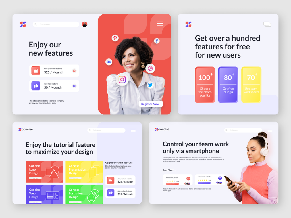
Concise – Logo Branding
🚀 Concise – Logo Branding 🖌️
Introducing the Concise logo, where simplicity meets impact. The logo embodies the essence of clarity, precision, and a forward-thinking approach. Let’s delve into the key elements that make Concise’s logo a visual representation of its brand identity.
📝 Clean Typography – Distinctive and Readable 🕊️
Concise’s logo features clean and distinct typography. The choice of font reflects the brand’s commitment to clarity and readability. The letters are carefully crafted to convey a sense of precision and professionalism.
🔺 Geometric Symbol – Unity and Simplicity 🌐
A geometric symbol accompanies the typography, representing unity and simplicity. The symmetrical design exudes balance and order, reinforcing Concise’s commitment to delivering clear and streamlined solutions. The geometric element adds a touch of modernity to the overall logo.
🎨 Minimal Color Palette – Understated Elegance 🌑
Concise opts for a minimal color palette, often incorporating shades of muted tones or monochromatic hues. This understated elegance communicates a sense of sophistication and professionalism. The logo’s simplicity ensures versatility across various applications and backgrounds.
🌑 Negative Space – Depth and Creativity 🚪
The use of negative space within the logo adds depth and sparks creativity. It’s a subtle yet impactful element that invites viewers to explore and discover hidden meanings. The interplay of positive and negative space reflects Concise’s ability to provide solutions that go beyond the surface.
🌐 Scalability – Impact Across Platforms 📐
Concise’s logo is designed with scalability in mind. Whether displayed on a business card or a large billboard, the logo maintains its impact and recognizability. The simplicity of the design ensures versatility across both digital and print mediums.
🕰️ Timeless Design – Enduring Relevance ⏳
The Concise logo is crafted with a timeless design philosophy. By avoiding trendy elements, the logo aims for enduring relevance. It’s a mark that withstands the test of time, aligning with Concise’s commitment to providing solutions that are both contemporary and enduring.
🔚 Conclusion – Clarity Redefined 🚀
In conclusion, Concise’s logo branding is a testament to the power of simplicity and clarity. The clean typography, geometric symbol, minimal color palette, use of negative space, scalability, and timeless design together redefine what it means to make a lasting visual impact. Concise’s logo is more than just a symbol; it’s a visual representation of a brand that values clarity, precision, and forward-thinking solutions. 🚀
— — — — — — — — — —
Want to collaborate? Email Us: hello@keitoto.com


