Keyzo – Finance Logo Branding
Keyzo – Finance Logo Branding 💼🔑
Unveil the essence of financial sophistication with the Keyzo Finance Logo Branding. This emblem is not just a visual representation; it encapsulates the core values of trust, security, and excellence in the financial domain. Let’s dissect the key elements that make Keyzo’s logo a distinguished symbol in the realm of finance.
🔑 Symbolism of the Key – Trust and Security
At the heart of Keyzo’s logo is the iconic key symbol. The key is universally recognized as a symbol of access, security, and control. In the context of finance, it represents the trustworthiness and security that Keyzo brings to its clients. The intricate detailing of the key communicates precision and attention to detail in financial matters.
💼 Monogram Integration – Professionalism and Identity
The incorporation of the monogram “K” within the key adds a layer of professionalism and brand identity to the logo. This monogram not only serves as an abbreviation for Keyzo but also reinforces the personalized and tailored financial solutions that the brand offers.
🌐 Circular Design – Wholeness and Continuity
The circular design surrounding the key symbolizes wholeness and continuity. It reflects Keyzo’s commitment to providing comprehensive financial services that cover the entirety of clients’ needs. The seamless circle also conveys the idea of a continuous, secure financial journey with Keyzo.
🌟 Gold Accents – Elegance and Prosperity
The choice of gold accents in the logo exudes elegance and prosperity. Gold is a symbol of wealth and success, aligning with the financial goals and aspirations of Keyzo’s clients. The subtle golden hues convey a sense of refinement and excellence in financial services.
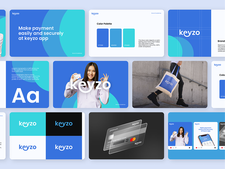
🔷 Blue Color Palette – Trust and Stability
The predominant use of a blue color palette instills a sense of trust and stability. Blue is often associated with reliability and dependability, making it an ideal choice for a finance logo. The varying shades of blue in the logo project a harmonious and calming effect, reinforcing Keyzo’s commitment to stability in financial matters.
📐 Clean Lines and Typography – Modernity and Precision
The clean lines and modern typography in Keyzo’s logo evoke a sense of modernity and precision. The sleek design represents Keyzo as a forward-thinking and technologically adept financial institution. The use of clean lines ensures clarity and readability, reflecting the transparency that Keyzo advocates.
🌈 Versatility – Adaptability Across Platforms
Keyzo’s logo is designed with versatility in mind. Whether displayed on a website, business card, or any other platform, the logo retains its visual impact and clarity. The adaptability of the logo ensures a consistent brand presence across various mediums, reinforcing Keyzo’s strong brand identity.
🌐 Conclusion – Keyzo Finance Logo: Unlocking Financial Excellence
In conclusion, the Keyzo Finance Logo Branding is a visual masterpiece that goes beyond aesthetics. With the symbolism of the key, the integration of the monogram, circular design, gold accents, blue color palette, clean lines, modern typography, and versatile adaptability, Keyzo’s logo serves as a beacon of trust, security, and financial excellence. It is not just a symbol; it’s a promise to unlock a world of financial possibilities for clients. Keyzo stands at the forefront of financial innovation and reliability, ready to guide clients on their journey to prosperity. 💼🔑🌐
— — — — — — — — — —
Want to collaborate? Email Us: hello@keitoto.com


