Ascend – Tecnology Logo Branding
🌐 Ascend – Technology Logo Branding 🚀
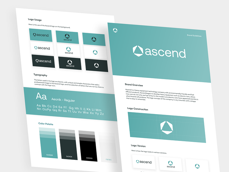
Ascend, a brand that symbolizes technological advancement and innovation, unveils its logo with a design that reflects forward-thinking and a commitment to excellence. Let’s delve into the key elements of Ascend’s technology logo branding, capturing the essence of the brand’s vision and identity.
🔺 Geometric Elegance – Symbol of Progress
The Ascend logo incorporates geometric elements, particularly a sleek triangle, symbolizing progress and upward movement. The triangle, pointing upwards, signifies Ascend’s commitment to continuous growth, advancement, and elevation in the realm of technology.
🌐 Circuitry Connectivity – Technological Integration
Within the triangle, intricate circuitry patterns create a sense of technological integration. This design element emphasizes Ascend’s role in the tech landscape, highlighting connectivity, efficiency, and the seamless integration of cutting-edge solutions.
🚀 Dynamic Motion Lines – Forward Momentum
Dynamic motion lines surrounding the triangle convey a sense of forward momentum and energy. These lines evoke the idea of Ascend propelling itself into the future, embracing dynamic changes, and staying ahead in the fast-paced world of technology.
🎨 Modern Color Palette – Innovation and Sophistication
Ascend’s logo employs a modern color palette, often featuring shades of blue and silver. Blue signifies trust, reliability, and stability, while silver adds a touch of sophistication and a futuristic aesthetic. Together, these colors represent Ascend’s commitment to innovation and technological excellence.
🌟 Minimalistic Typography – Clean and Impactful
Accompanying the symbol is a minimalistic and impactful typography choice. The clean lines and contemporary font reflect Ascend’s dedication to clarity and effectiveness. The simplicity of the typography ensures that the focus remains on the symbolic elements of the logo.
💡 Illumination Effect – Enlightening Possibilities
A subtle illumination effect within the logo adds a layer of depth and symbolism. It represents the idea that Ascend illuminates possibilities and brings light to the technological landscape. The glowing effect reinforces the brand’s commitment to enlightening solutions and forward-thinking innovation.
⚙️ Precision and Detailing – Technological Precision
The precision and detailing in Ascend’s logo emphasize the brand’s commitment to technological excellence. Every line and curve is carefully crafted, reflecting the meticulous approach that Ascend takes in delivering precise and high-quality technological solutions.
🌈 Versatility – Adaptable Across Platforms
Ascend’s logo is designed for versatility, ensuring adaptability across various platforms and mediums. Whether displayed on digital screens, print materials, or merchandise, the logo retains its impact and recognizability, reflecting the brand consistently.
🌍 Global Appeal – Tech on a Global Scale
The symbolism within Ascend’s logo extends to a global scale. The triangle, circuitry, and forward-motion lines collectively convey Ascend’s ambition to impact the global technological landscape, positioning itself as a key player on the world stage.
🌟 Futuristic Vision – Leading Tomorrow’s Technology
In summary, Ascend – Tecnology Logo Branding encapsulates a futuristic vision, symbolizing the brand’s commitment to leading tomorrow’s technology. With geometric elegance, circuitry connectivity, and dynamic motion, Ascend positions itself as a beacon of innovation, ready to ascend to new heights in the ever-evolving tech industry. 🚀🌐🔝
— — — — — — — — — —
Want to collaborate? Email Us: hello@keitoto.com


