Chalatix – Creative Design Agency Landing Responsive Version
🎨🌐 Chalatix: Responsive Creativity – Creative Design Agency Landing Page 🚀✨
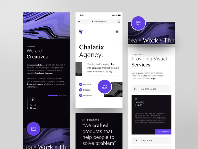
Welcome to the responsive version of Chalatix, where creativity adapts seamlessly to every screen size. Our Creative Design Agency Landing Page isn’t just about aesthetics; it’s about ensuring that the visual feast and interactive experience extend to users across devices. Let’s delve into the features that make Chalatix’s responsive version an enchanting journey for all.
📱 Fluid and Adaptive Design
Chalatix’s responsive landing page boasts a fluid and adaptive design, ensuring that the visual narrative remains captivating whether viewed on a desktop, tablet, or smartphone. The layout adjusts dynamically, preserving the essence of Chalatix’s creative brilliance on screens of all sizes.
🎭 Responsive Iconography
Chalatix’s iconic dance of pens, brushes, and pixels remains just as expressive on smaller screens. The responsive iconography adapts gracefully, maintaining clarity and artistic allure. Every icon is a masterpiece, regardless of the device in the user’s hands.
🔍 Optimized Visual Showcase
The responsive version optimizes the visual showcase for each device, ensuring that the immersive journey through Chalatix’s portfolio remains a visual feast. High-resolution images and dynamic displays retain their impact, providing an optimal viewing experience for every visitor.
🔄 Intuitive Navigation for Touch
Chalatix’s responsive landing page features intuitive navigation tailored for touch interfaces. Users can effortlessly swipe through the portfolio, explore services, and engage with interactive elements, fostering a tactile and enjoyable experience on mobile devices.
🌈 Consistent Color Palette
The vibrant color palette of Chalatix remains consistent across devices, infusing the responsive landing page with energy and creativity. Whether on a large desktop monitor or a compact smartphone screen, users are greeted with a harmonious blend of colors that reflects the agency’s artistic ethos.
📏 Grid Layout for Orderly Content
The grid layout adapts seamlessly to different screen sizes, ensuring that content remains orderly and visually appealing. From project showcases to team introductions, the responsive version maintains a structured and balanced presentation on every device.
💻 Interactive Team Member Profiles
Explore the profiles of Chalatix’s creative maestros through interactive team member sections. The responsive version ensures that users on various devices can engage with and learn about the talented individuals who contribute to Chalatix’s creative tapestry.
📞 Contact Form Accessibility
Connecting with Chalatix is made easy with an accessible contact form. The responsive design ensures that users on mobile devices can effortlessly fill out the form, initiating a seamless communication process with the agency’s creative minds.
🌟 Consistent Brand Storytelling
Chalatix’s brand storytelling remains consistent across devices, delivering a cohesive narrative that resonates with visitors. The responsive version ensures that every aspect of the agency’s story, from its inception to its creative philosophy, is communicated effectively on screens of all sizes.
In conclusion, Chalatix’s Responsive Creative Design Agency Landing Page isn’t just an adaptation; it’s a transformation that preserves the magic of creativity across diverse devices. With fluid design, responsive iconography, optimized visuals, touch-friendly navigation, a consistent color palette, grid layout, interactive team profiles, accessible contact forms, and consistent brand storytelling, Chalatix ensures that the artistic journey remains enchanting, regardless of the screen in hand. Immerse yourself in the responsive creativity of Chalatix – where every pixel tells a vibrant story! 🎨🌐🚀✨
— — — — — — — — — —
Want to collaborate? Email Us: hello@keitoto.com


