Flywings – Real Estate Agency Logo Branding
✨ Flywings Real Estate Agency Logo Branding – Soar Above the Rest 🕊️
Welcome to Flywings, where real estate takes flight with a logo branding that encapsulates the spirit of elevation, professionalism, and forward momentum. Explore the elements that make Flywings a symbol of excellence in the realm of real estate, setting your agency apart and inviting clients to soar above the rest. 🏢🚀
🏠 Elevated Architecture – The Essence of Flywings
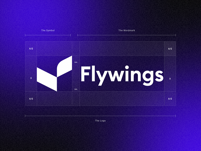
The Flywings logo captures the essence of elevated architecture, symbolized by a pair of wings gracefully extending from a central hub. These wings represent the soaring aspirations, professionalism, and forward momentum that define Flywings as a premier real estate agency. The clean lines and dynamic symmetry convey a sense of stability and trustworthiness, creating an immediate visual impact. 🎨
🌈 Trustworthy Color Palette – Soothing Tones, Trustworthy Hues
The color palette of Flywings Real Estate Agency Logo is carefully curated to evoke a sense of trust and reliability. A harmonious blend of soothing tones, such as deep blues and soft grays, creates an aesthetic that is both professional and approachable. These colors not only convey a sense of stability but also reflect the commitment of Flywings to provide a secure foundation for its clients’ real estate endeavors. 🔍
🕊️ Wings of Professionalism – Symbol of Aspiration
The wings in the Flywings logo serve as a powerful symbol of aspiration and achievement. As they gracefully extend, they represent the agency’s dedication to helping clients reach new heights in their real estate endeavors. The dynamic movement of the wings conveys a sense of progress and forward momentum, aligning Flywings with the aspirations of its clients. 🌐
🔍 Magnifying Glass Detail – Attention to Detail in Every Transaction
The magnifying glass detail within the central hub of the Flywings logo emphasizes the agency’s commitment to attention to detail in every real estate transaction. It symbolizes the thoroughness and diligence with which Flywings approaches property searches, ensuring that every client receives a meticulous and comprehensive service. 🏠
🔗 Global Reach – Connecting Clients Worldwide
The circular shape encompassing the wings and magnifying glass represents the global reach of Flywings. It signifies the agency’s ability to connect clients with real estate opportunities not only locally but on a broader scale. Flywings invites clients to explore a world of possibilities, and the circular element reinforces the idea of a well-rounded and comprehensive real estate service. 🚀
In conclusion, the Flywings Real Estate Agency Logo Branding is more than a visual identity; it’s a symbol of taking real estate to new heights. With its elevated architecture, trustworthy color palette, wings of professionalism, magnifying glass detail, and global reach symbolism, Flywings sets the standard for a real estate agency that is not only grounded in expertise but also ready to soar above the rest. Elevate your real estate journey with Flywings – where every property transaction is a journey to new heights. 🌐🏢
— — — — — — — — — —
Want to collaborate? Email Us: hello@keitoto.com


