Hefood – Healthy Food Company Logo Branding
🥗 Hefood – Nourishing Logo Branding for a Healthy Food Company 🌱✨
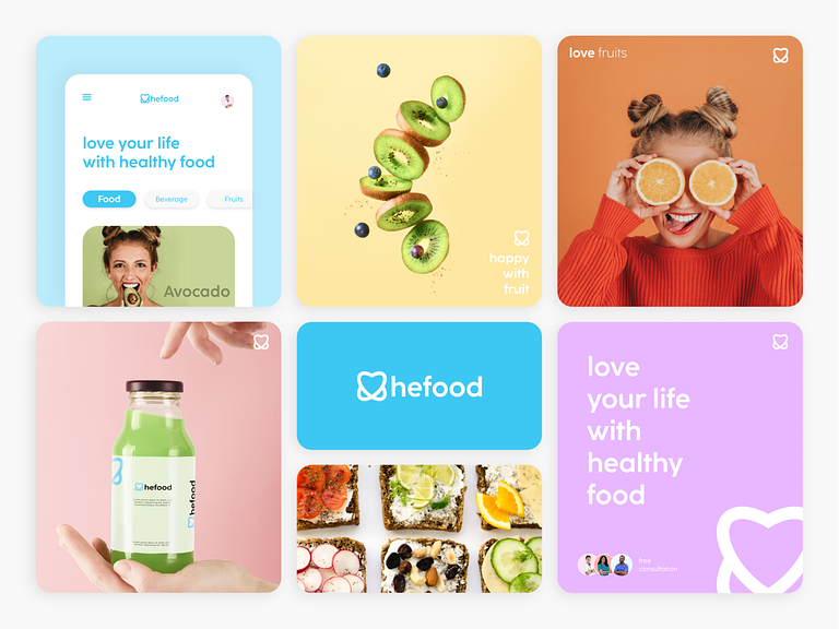
Welcome to the world of Hefood, where every bite is a step towards wellness. The Hefood Healthy Food Company Logo Branding is meticulously crafted to reflect the brand’s commitment to health, freshness, and a wholesome culinary experience. Let’s explore the key elements that make the Hefood logo a symbol of nourishment and vitality.
🌿 Symbolic Leaf Emblem
At the core of the Hefood logo is a symbolic leaf emblem. Representing freshness, vitality, and the essence of natural ingredients, the leaf serves as a visual anchor. Its organic form conveys the brand’s dedication to offering health-conscious and plant-centric food options.
🌈 Nature-Inspired Color Palette
Hefood’s color palette is inspired by the vibrant hues found in nature. A combination of fresh greens and earthy tones establishes a connection with the wholesome ingredients used in Hefood’s offerings. The color scheme evokes a sense of health, well-being, and natural goodness.
🍏 Subtle Culinary Elements
Integrate subtle culinary elements into the logo to hint at the artistry of Hefood’s creations. Whether it’s a stylized utensil, a grain motif, or a delicate culinary tool, these elements add a touch of sophistication and convey the brand’s commitment to culinary excellence.
🎨 Clean and Modern Typography
The brand name “Hefood” is presented in a clean and modern typeface. The typography balances readability with a touch of contemporary flair, aligning with the brand’s positioning as a modern and health-conscious food company. The lettering is carefully spaced for a harmonious and polished composition.
🌐 Versatility in Monochrome
The Hefood logo is designed to maintain its impact even in monochrome. Whether in black and white or various shades of green, the logo retains its clarity and brand consistency. This versatility ensures recognizability across a range of applications, from packaging to digital platforms.
🌟 Wholesome and Inclusive Aesthetic
The overall aesthetic of the Hefood logo radiates wholesomeness and inclusivity. The combination of the leaf emblem, nature-inspired colors, and clean typography creates an image that appeals to a broad audience seeking health-conscious and inclusive dining options.
🍴 Culinary Harmony
Achieve a sense of culinary harmony by ensuring that all elements in the logo work seamlessly together. The leaf emblem, color palette, typography, and any additional elements should coalesce to convey a unified message of health, freshness, and the joy of nourishing meals.
🌱 Timeless Appeal
The Hefood logo is crafted with a timeless appeal, transcending trends and remaining relevant in the dynamic food industry. The design aims to create a lasting impression, becoming a familiar and trusted symbol for those seeking a healthy and flavorful culinary experience.
In conclusion, the Hefood Healthy Food Company Logo Branding is a visual embodiment of the brand’s commitment to providing nourishing and wholesome food options. With a leaf emblem symbolizing freshness, a nature-inspired color palette, and clean typography, the logo invites customers to indulge in a culinary journey that prioritizes health and well-being. 🥗🌱✨
— — — — — — — — — —
Want to collaborate? Email Us: hello@keitoto.com


