⛽🚀 Nitro – Gas Mining Company Logo Branding: Igniting Energy, Fueling Progress 🔥💼
Behold the dynamic logo branding of Nitro, a cutting-edge gas mining company that’s not just extracting resources; it’s igniting energy and fueling progress. The Nitro logo encapsulates the essence of power, innovation, and sustainable energy practices, reflecting the company’s commitment to pushing boundaries in the gas mining industry.
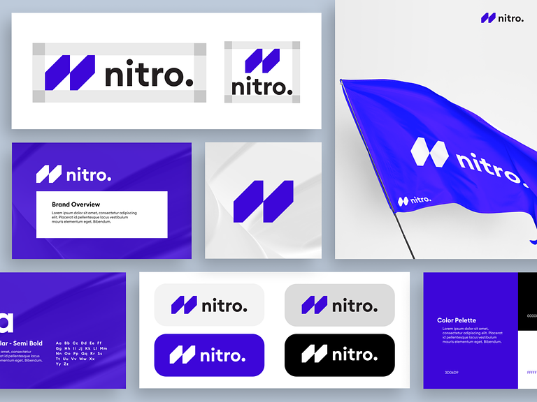
🎨 Logo Design – The Nitro Emblem
The Nitro emblem is a bold representation of the company’s identity. A sleek, stylized gas flame takes center stage, symbolizing energy in its most potent form. The flame is crafted with precision, exuding a sense of controlled intensity that aligns with Nitro’s commitment to efficient and safe gas mining.
🚀 Dynamic Typography – Energizing the Brand Name
Nitro’s brand name is rendered in dynamic typography that complements the flame emblem. The letters are sharp and modern, conveying a sense of innovation and forward-thinking. The flowing lines within the typography reflect the fluidity and adaptability inherent in the gas mining industry.
🌐 Color Palette – Igniting Passion and Professionalism
Nitro’s color palette combines the passion of fiery red with the professionalism of sleek black. The red flame symbolizes the energy extracted by Nitro, while black represents the depth and sophistication of the gas mining process. The combination evokes a powerful visual impact that resonates with both strength and reliability.
🔍 Iconic Symbolism – Layers of Meaning
Beyond its immediate representation of a flame, the Nitro logo carries layers of symbolism. The upward motion of the flame signifies progress, growth, and the rising trajectory of Nitro’s endeavors. The flame’s fluid lines suggest the dynamic nature of gas mining and the company’s adaptability to changing industry landscapes.
💡 Tagline Integration – Power in Every Particle
A strategic tagline, “Power in Every Particle,” is seamlessly integrated into the Nitro logo. This concise and impactful phrase encapsulates the company’s core philosophy—each gas particle extracted by Nitro contributes to a powerful and sustainable energy future.
🌍 Adaptability – From Business Cards to Billboards
The Nitro logo is designed for adaptability across various platforms. Whether it’s displayed on business cards, corporate stationery, or towering billboards, the logo retains its clarity and impact. Its scalable design ensures that Nitro’s brand identity remains consistent and recognizable across diverse mediums.
💻 Digital Versatility – Evoking Energy in the Digital Realm
In the digital realm, the Nitro logo comes to life with vibrant energy. Whether it’s on the company’s website, social media profiles, or digital presentations, the logo’s dynamic design translates seamlessly, ensuring a captivating and cohesive online presence.
🌟 Conclusion – Nitro: Where Energy Meets Innovation
In conclusion, Nitro’s Gas Mining Company Logo Branding encapsulates the spirit of a company that’s not just mining gas; it’s unlocking energy potential and driving innovation in the industry. From the dynamic emblem and typography to the fiery color palette and iconic symbolism, Nitro’s logo is a visual testament to the company’s commitment to powering progress. Welcome to Nitro—where energy meets innovation, particle by particle. 🔥💼⛽
— — — — — — — — — —
Want to collaborate? Email Us: hello@keitoto.com


