Quick – Car Dealership Logo Concept
🚗 Welcome to Quick – Where Speed Meets Elegance! 🏁
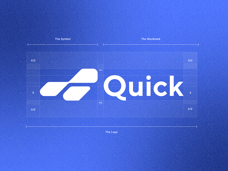
Embark on a visual journey through the exciting world of Quick, a car dealership that blends speed, sophistication, and seamless transactions. Let’s explore the concept behind the Quick Car Dealership Logo, capturing the essence of automotive excellence.
🎨 Sleek and Streamlined Design – The Fast Lane Aesthetic
The Quick logo boasts a sleek and streamlined design, symbolizing the efficiency and speed that defines our car dealership. The flowing lines and dynamic curves evoke the sensation of being in the fast lane, creating an immediate visual connection to the world of swift and elegant automobiles.
🏁 Racing Stripes – A Nod to Speed and Performance
Incorporating racing stripes into the logo pays homage to the world of motorsports, emphasizing Quick’s commitment to speed and high-performance vehicles. The stripes add a dynamic and energetic element, reinforcing the idea that at Quick, every transaction is as swift as a race car on the track.
🚗 Dynamic Car Silhouette – Symbol of Automotive Excellence
A dynamic silhouette of a car takes center stage, serving as the focal point of the Quick logo. This element not only reinforces the brand’s association with the automotive industry but also adds a touch of sophistication. The carefully crafted car silhouette represents the high-quality vehicles available at Quick.
💡 Modern Typography – Speed in Every Letter
The typography used in the Quick logo is modern and bold, reflecting the brand’s forward-thinking approach. The letters convey a sense of speed, with sleek lines and contemporary styling. The use of bold typography ensures that the brand name is easily readable, leaving a lasting impression.
🔵 Striking Color Palette – Elegance and Trust
The color palette features a striking combination of deep blue hues, representing trust, reliability, and elegance. Blue is a timeless color associated with the automotive industry, and in the Quick logo, it adds a touch of sophistication while instilling confidence in the brand.
🌐 Circular Emblem – Unity and Wholeness
The Quick logo is encapsulated within a circular emblem, symbolizing unity and wholeness. This design choice communicates that Quick is a complete and well-rounded solution for all automotive needs. The circular shape also adds a sense of continuity and perpetuity, emphasizing Quick’s enduring commitment to excellence.
In conclusion, the Quick Car Dealership Logo Concept is a fusion of speed, elegance, and automotive excellence. With its sleek design, racing stripes, dynamic car silhouette, modern typography, striking color palette, and circular emblem, the Quick logo encapsulates the essence of a dealership where every transaction is quick, seamless, and infused with a touch of sophistication. 🚗🏁
— — — — — — — — — —
Want to collaborate? Email Us: hello@keitoto.com


