Real Estate Investment Logo
EstateCore – Elevating Real Estate Investment with Iconic Logo Design 🏡💼
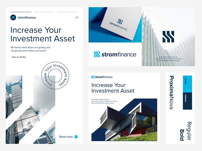
EstateCore introduces a sophisticated logo design tailored for investment ventures, capturing the essence of professionalism, trust, and growth in the property market. Let’s delve into the key elements that make EstateCore’s logo branding a standout in the realm of investment.
🏢 Architectural Symbolism – Representing Property Investment
At the heart of EstateCore’s logo design is an architectural symbol that embodies the essence of investment. This symbol may take the form of a stylized building silhouette, a key, or a door, symbolizing opportunities for growth, security, and prosperity in property investment ventures.
💼 Business Elegance – Conveying Professionalism and Trust
EstateCore’s logo design exudes business elegance, conveying professionalism, reliability, and trustworthiness in investment endeavors. The sleek typography, clean lines, and balanced composition reflect the company’s commitment to excellence and integrity in all business dealings.
🌟 Iconic Branding – Building Recognition and Credibility
EstateCore’s logo serves as an iconic representation of the brand, building recognition and credibility within the investment community. Its timeless design and memorable visual elements make it instantly recognizable, establishing EstateCore as a reputable and trustworthy player in the market.
🏡 Property Market Focus – Emphasizing Residential and Commercial Assets
The logo design may incorporate elements that emphasize the focus on both residential and commercial properties. Whether through subtle imagery or text, EstateCore’s logo highlights the diverse investment opportunities available in the property market, catering to investors with varying interests and objectives.
📈 Growth and Prosperity – Inspiring Confidence in Investment Potential
EstateCore’s logo evokes feelings of growth, prosperity, and success, instilling confidence in the investment potential of the properties it represents. The upward trajectory of the design elements symbolizes rising property values, lucrative returns, and long-term financial stability for investors.
🎨 Color Psychology – Enhancing Brand Identity and Perception
The color palette chosen for EstateCore’s logo design is carefully selected to enhance brand identity and perception. Colors such as deep blue, rich green, or regal gold may be used to convey trust, stability, and sophistication, aligning with the aspirations and values of discerning real estate investors.
🔍 Attention to Detail – Reflecting Commitment to Excellence
EstateCore’s logo design reflects meticulous attention to detail, mirroring the company’s commitment to excellence in every aspect of its operations. From the precise lines and proportions to the thoughtful choice of colors and typography, every element is carefully crafted to convey professionalism and quality.
🌐 Versatility and Adaptability – Suitable for Various Applications
EstateCore’s logo is designed with versatility and adaptability in mind, making it suitable for various applications across different marketing channels and platforms. Whether displayed on digital screens, printed materials, or signage, the logo maintains its integrity and impact, reinforcing the brand’s identity consistently.
🚀 Conclusion – EstateCore’s : Symbolizing Growth and Opportunity
In conclusion, EstateCore’s logo design symbolizes growth, opportunity, and prosperity in the dynamic world of real estate investment. With its architectural symbolism, business elegance, iconic branding, property market focus, emphasis on growth and prosperity, color psychology, attention to detail, versatility, and adaptability, EstateCore’s logo captures the essence of professionalism, trust, and growth in property investment ventures. It’s not just a logo; it’s a symbol of confidence and success in the ever-evolving landscape of real estate investment. 🏡💼
— — — — — — — — — —
Want to collaborate? Email Us: work@keitoto.com


