Rebuild. – Contractor Company Logo Design
🏗️🔧 Rebuild. – Contractor Company Logo Design: Crafting Foundations, Building Futures 🏠🛠️
Step into the world of Rebuild., where craftsmanship meets innovation. The Rebuild. Contractor Company Logo Design is not just a visual identity; it’s a testament to the dedication of a company committed to crafting solid foundations and building futures. Let’s explore the design elements that make the Rebuild. logo stand out in the realm of contractor company branding.
🏠 Iconic Building Blocks – Symbolizing Construction Excellence
At the heart of the Rebuild. logo is the representation of building blocks, symbolic of the construction excellence that the company stands for. These iconic blocks convey the fundamental nature of the contractor’s work, emphasizing the foundational role Rebuild. plays in constructing robust structures that stand the test of time.
🔧 Craftsman’s Wrench – A Nod to Skilled Artisanship
Incorporated within the logo is the silhouette of a craftsman’s wrench, paying homage to the skilled artisanship embedded in Rebuild.’s services. The wrench is a symbol of precision and hands-on expertise, reflecting the company’s commitment to quality craftsmanship in every aspect of construction and renovation.
🌐 Circle of Continuity – Unifying Vision and Legacy
The circular framing around the logo elements signifies continuity, unity, and a holistic approach to construction projects. It reflects Rebuild.’s unwavering commitment to a unified vision, ensuring that each project contributes to a lasting legacy. The circle represents the cyclical nature of construction, where every completion is a new beginning.
🌟 Elegant Typography – A Blend of Modernity and Reliability
The brand name “Rebuild.” is presented in elegant and modern typography. The clean lines and balanced spacing convey a sense of reliability and professionalism. The use of bold lettering adds a touch of strength and stability, aligning with the core values of a contractor company dedicated to building strong foundations.
🎨 Color Palette – Earthy Tones of Trust and Durability
Rebuild.’s color palette is carefully selected to evoke trust and durability. Earthy tones, such as deep browns and sturdy grays, resonate with the construction industry’s reliability. These colors not only convey a sense of groundedness but also align with Rebuild.’s commitment to constructing structures that withstand the test of time.
🛠️ Tool Accents – Representing Versatility in Services
Subtle tool accents, such as screws and bolts, are strategically placed within the logo. These details symbolize the versatility of Rebuild.’s services, from intricate renovations to large-scale construction projects. The inclusion of tools reinforces the company’s capability to handle a diverse range of tasks with precision and expertise.
🚀 Upward Arrows – Aspirations and Growth
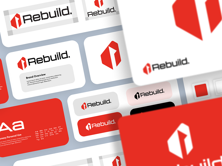
In the negative space between the building blocks, upward arrows are subtly integrated. These arrows represent aspirations and growth, symbolizing the upward trajectory that clients can expect when choosing Rebuild. for their construction needs. It reflects the company’s commitment to not just building structures but elevating visions.
💡 Conclusion – Rebuild. Logo: Building Tomorrow, Today
In conclusion, the Rebuild. Contractor Company Logo Design is a visual embodiment of the company’s ethos—crafting tomorrow by building today. With iconic building blocks, a craftsman’s wrench, a circle of continuity, elegant typography, an earthy color palette, tool accents, and upward arrows, the logo resonates with reliability, versatility, and a commitment to growth. Welcome to a world where construction is an art, and every structure is a testament to Rebuild.’s dedication to excellence. 🏗️🔧🏠
— — — — — — — — — —
Want to collaborate? Email Us: hello@keitoto.com


