Square – Construction Company – Branding Design
Welcome to Square – A Construction Company Redefined Through Distinctive Branding Design. Explore the innovative and impactful visual identity that defines Square’s presence in the construction industry, where strength, precision, and modernity converge to reflect the essence of your brand.
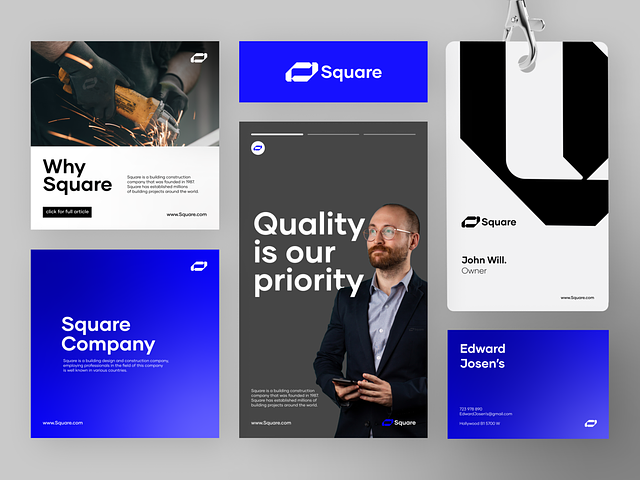
Logo Design
Square’s logo embodies strength and stability. The square shape, a symbol of solidity and precision, forms the core of the design. Its clean lines and sharp angles convey professionalism, while the bold typography complements the overall aesthetic. The choice of color—perhaps a robust and versatile combination like deep blue or charcoal gray—further reinforces Square’s commitment to reliability and trustworthiness.
Brand Colors
The color palette for Square’s branding design is meticulously chosen to evoke a sense of dependability and sophistication. Deep, earthy tones, such as rich browns or muted greens, resonate with the construction industry, symbolizing durability and groundedness. These colors not only speak to the practicality of construction but also add a touch of modernity and professionalism.
Typography
The typography selected for Square is sleek and modern, reflecting a commitment to contemporary construction practices. Sans-serif fonts with clean lines and a bold presence convey reliability and straightforwardness. The chosen typeface complements the logo, ensuring a cohesive and harmonious visual identity across all brand materials.
Imagery and Visual Elements
Square’s branding design incorporates imagery that resonates with the construction theme. High-quality photographs showcasing completed projects, skilled professionals in action, and intricate architectural details add a human touch to the brand. Iconography representing construction elements, like blueprints, cranes, and building structures, reinforces the industry focus.
Stationery Design
From business cards to letterheads, Square’s stationery design maintains a consistent and professional appearance. The logo takes center stage, while the chosen color palette and typography are seamlessly integrated. The stationery design reflects the precision and attention to detail that Square brings to its construction projects.
Website Design
Square’s website design is a digital extension of its visual identity. A clean and intuitive layout, coupled with high-quality images of completed projects, creates a powerful online presence. The website emphasizes user-friendly navigation, showcasing Square’s portfolio, services, and commitment to excellence in the construction sector.
Branding Collateral
Whether it’s brochures, presentations, or promotional materials, Square’s branding collateral maintains a cohesive design language. Consistent use of the logo, colors, and typography ensures that every piece of collateral reinforces the brand’s identity and leaves a lasting impression on clients and stakeholders.
Branding Guidelines
Square’s branding guidelines serve as a comprehensive manual, outlining the rules for logo usage, color specifications, typography guidelines, and more. These guidelines empower all stakeholders to maintain a consistent and recognizable brand image across various platforms and communications.
— — — — — — — — — —
Want to collaborate? Email Us: hello@keitoto.com


