Wmail. – Document Delivery Service Logo & Branding
Wmail. – Document Delivery Service Logo & Branding: Bridging Connectivity with Professionalism 📧🚀
Welcome to the brand identity of Wmail., a cutting-edge Document Delivery Service that combines seamless communication with a touch of professionalism. The logo and branding are meticulously crafted to embody the essence of efficient document delivery in a digital age.
Logo Concept:
The Wmail. logo is a fusion of a sleek envelope and an abstract, stylized letter “W.” The envelope represents the delivery aspect of the service, while the “W” embodies the brand name, adding a personal touch. The combination signifies the seamless and personalized document delivery services provided by Wmail.
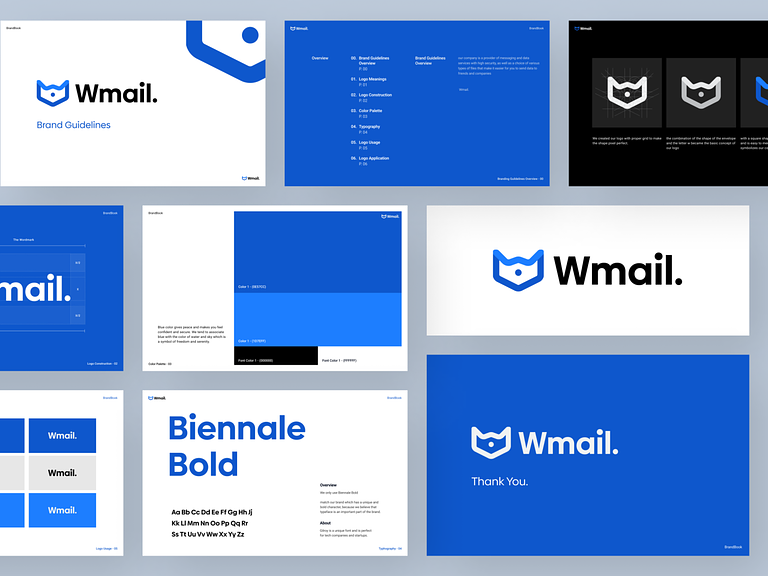
Color Palette:
The color palette revolves around professional and modern hues. Deep navy blue exudes reliability and trustworthiness, reflecting the secure nature of document delivery. Complemented by a vibrant teal, the palette suggests a forward-thinking approach and a commitment to innovation. These colors create a visual identity that is both professional and approachable.
Typography:
The typography chosen for Wmail. strikes a balance between modernity and professionalism. A clean and bold sans-serif font communicates clarity and straightforwardness, emphasizing the efficiency of the document delivery service.
Symbolism:
The rocket incorporated into the branding symbolizes speed and efficiency in document delivery. Positioned within the envelope, it reinforces the idea of swift and secure communication, propelling messages to their destination with precision.
Tagline:
“Connecting Beyond Boundaries” encapsulates the brand’s commitment to bridging communication gaps seamlessly. It emphasizes the global reach of the document delivery service, positioning Wmail. as a reliable partner in connecting people and businesses worldwide.
Brand Applications:
Website Interface: The website interface is designed with a user-friendly layout, offering easy navigation for users to send and receive documents securely. The color scheme remains consistent with the logo, reinforcing brand recognition.
Business Cards: The business cards maintain a clean and professional design, featuring the logo and tagline. The contact details are presented clearly, emphasizing Wmail.’s commitment to efficient communication.
App Icon: The app icon incorporates a simplified version of the logo, ensuring instant recognition on mobile devices. The teal accent adds a vibrant touch, enhancing visibility on various platforms.
Marketing Collaterals: Marketing materials, such as brochures and promotional posters, echo the brand’s visual identity. They highlight key features and benefits of Wmail.’s document delivery services while maintaining a consistent design language.
In conclusion, the Wmail. logo and branding embody a perfect synergy of professionalism and innovation. The sleek logo, cohesive color palette, clear typography, and meaningful symbolism collectively establish a brand identity that resonates with Wmail.’s commitment to efficient, secure, and global document delivery services. 📧🚀 #WmailBranding #EfficiencyRedefined #GlobalCommunication”
— — — — — — — — — —
Want to collaborate? Email Us: hello@keitoto.com


