Yupet – Pet Food Company Logo Design
🐾🍽️ Yupet – Unleashing Flavor, Nourishing Pets 🎨✨
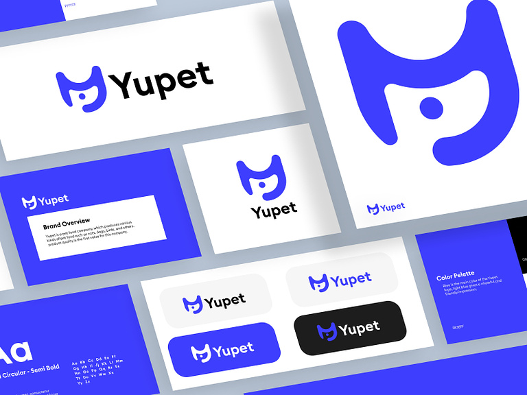
Introducing the Yupet Pet Food Company Logo Design, a visual representation of a brand committed to providing wholesome and delicious meals for our beloved furry companions. Let’s delve into the design elements and thoughtful styles that make the Yupet logo a symbol of nourishment and delight for pets.
🐾 Playful Paw Print – The Essence of Pets
At the core of the Yupet logo is a playful paw print, capturing the very essence of pets. This symbol not only represents the connection with animals but also conveys a sense of joy and lightheartedness. The paw print communicates Yupet’s dedication to catering to the needs and happiness of pets.
🍽️ Pet Bowl – A Feast of Flavor
The incorporation of a pet bowl within the logo signifies the delightful feast that Yupet offers to pets. It’s a visual representation of a well-served meal, inviting pets to indulge in a flavorful and satisfying dining experience. The bowl symbolizes the care and attention Yupet puts into crafting nutritious and tasty pet food.
🌈 Color Palette – Vibrancy and Variety
The choice of a vibrant color palette reflects the variety of flavors and options that Yupet brings to pet dining. The colors are carefully selected to evoke a sense of freshness, healthiness, and diversity. The lively hues communicate the joy and excitement Yupet aims to bring to pets through its range of food products.
🌟 Stylized Font – Modernity and Trustworthiness
Yupet’s logo features a stylized and modern font that exudes trustworthiness. The clean lines and contemporary design convey a sense of professionalism while maintaining a friendly and approachable aesthetic. The font choice reflects Yupet as a reliable and modern pet food brand.
🌾 Ear of Wheat – Natural Ingredients
A subtle yet meaningful element, the ear of wheat incorporated into the logo represents the natural and wholesome ingredients used in Yupet’s pet food. It symbolizes the commitment to providing nutrition derived from nature, emphasizing the quality and health-conscious approach of Yupet’s products.
🔆 Sunburst – Vitality and Energy
The sunburst element radiates around the logo, symbolizing the vitality and energy that Yupet aims to infuse into pets through its nourishing meals. It conveys the idea that Yupet’s pet food is designed to keep pets vibrant, healthy, and full of life.
🌟 Conclusion – Yupet: A Feast for Furry Friends
In conclusion, the Yupet Pet Food Company Logo Design encapsulates the brand’s dedication to providing a feast of flavor for our furry friends. With a playful paw print, a pet bowl, a vibrant color palette, a stylized font, an ear of wheat, and a sunburst, the logo becomes a visual celebration of the joy, health, and nourishment that Yupet brings to pets. Welcome to Yupet, where every bowl, every bite, and every wagging tail signify the happiness and well-being of our beloved companions. 🐾🍽️🎨✨
— — — — — — — — — —
Want to collaborate? Email Us: hello@keitoto.com


