
Sinausek – Online course Landing Page

Sinausek - Online course Landing Page

Sinausek – Online course Landing Page

πŸŽ“ Sinausek – Online Course Landing Page πŸŒπŸ“š

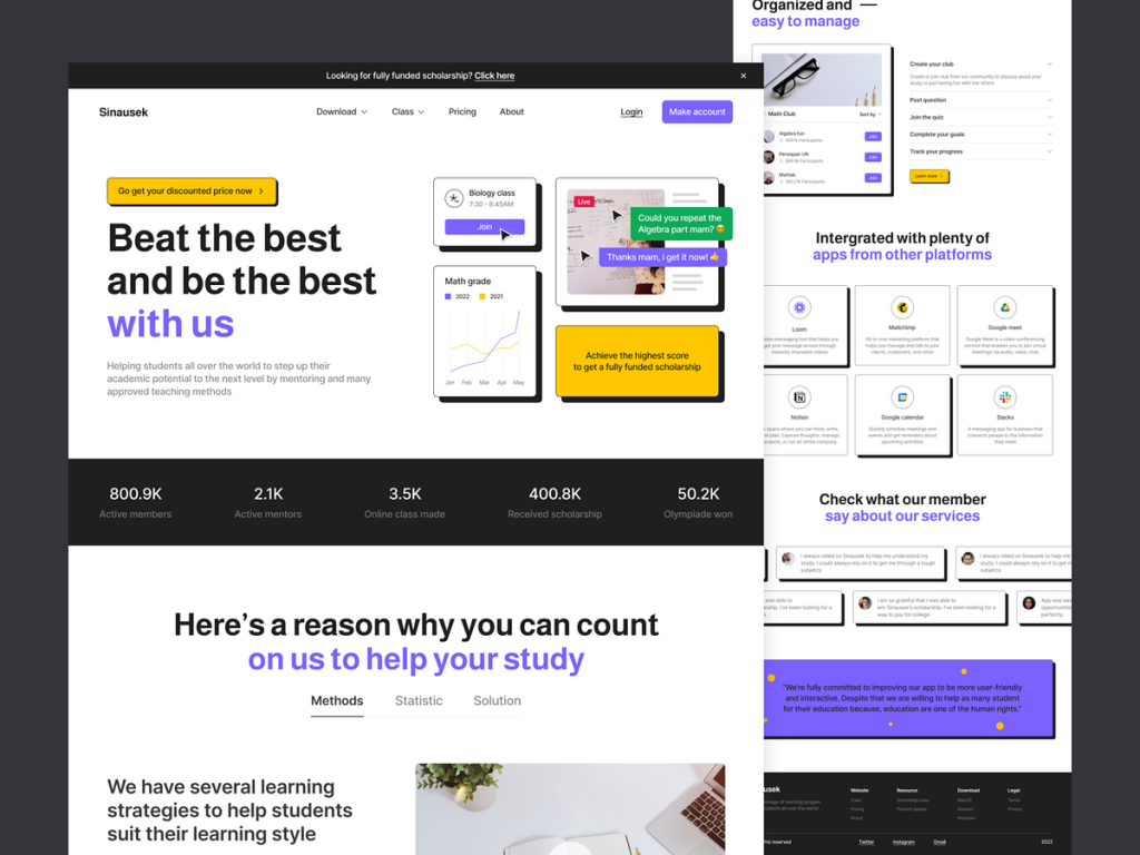
Embark on a learning journey with Sinausek, where knowledge meets innovation. The Online Course Landing Page is meticulously designed to provide a seamless and engaging experience for learners. Let’s explore the key features and design elements that make Sinausek a premier destination for online education.

🌟 Hero Section – Inspiring Welcome

The landing page begins with a captivating hero section featuring animated visuals of eager learners and a diverse range of courses. This section sets an inspiring tone, welcoming visitors to the world of Sinausek with a call to embark on a knowledge-enhancing adventure.

πŸ“š Course Categories – Visual Navigation

Navigate through diverse course categories with visually appealing icons and animated transitions. Each category is represented by engaging visuals, and animated tooltips provide additional information on hover. This dynamic approach ensures an intuitive and visually stimulating course exploration.

πŸŽ“ Featured Courses – Carousel Showcase

Explore featured courses through an animated carousel showcase. Dynamic transitions between courses, animated course titles, and brief descriptions create an immersive preview of Sinausek’s top offerings. Users can swipe or click through the carousel for a seamless browsing experience.

πŸ‘©β€πŸ« Instructor Highlights – Dynamic Profiles

Get to know Sinausek’s esteemed instructors through dynamic profiles. Animated instructor images, brief bios, and interactive social media links add a personal touch. Hover effects provide a playful interaction, encouraging users to connect with instructors.

πŸ’‘ Course Highlights – Animated Previews

Dive into course details with animated previews. Course highlights, animated curriculum overviews, and dynamic enrollment buttons make the learning journey enticing. Users can get a sneak peek into course content before making informed decisions.

πŸ“Š Student Testimonials – Interactive Reviews

Build trust with animated student testimonials. Engaging visuals, animated quotes, and dynamic star ratings create an interactive testimonial section. Users can scroll through or click on animated arrows to explore the positive experiences of past learners.

πŸ“… Upcoming Events – Animated Calendar

Stay informed about upcoming events with an animated calendar. Dynamic date highlights, animated event details, and interactive registration buttons make event discovery and enrollment a visually engaging experience.

πŸ–₯️ Responsive Design – Device Mockups

Assure users of a seamless learning experience across devices with animated device mockups. Visual icons of laptops, tablets, and smartphones showcase Sinausek’s responsive design. The animation demonstrates the adaptability of the platform to various screens.

πŸ’¬ Live Chat Support – Instant Assistance

Connect with Sinausek’s support team through an animated live chat feature. Real-time responses, animated typing indicators, and interactive chat bubbles create a dynamic and responsive support experience, ensuring learners can get instant assistance.

πŸ”₯ Limited-time Offers – Countdown Animation

Highlight limited-time offers with an animated countdown timer. Dynamic numbers, animated ticking, and vibrant visuals create a sense of urgency, encouraging users to take advantage of special promotions.

🌐 Social Media Integration – Animated Icons

Stay connected with Sinausek through animated social media icons. Hover effects and subtle animations accompany each icon, encouraging learners to explore and engage with Sinausek’s social media channels for the latest updates and educational content.

✨ Conclusion – Empowering Minds, Animated

In conclusion, Sinausek’s Online Course Landing Page is a visual masterpiece that seamlessly blends aesthetics with functionality. Through engaging visuals, dynamic elements, and user-friendly design, Sinausek invites learners to embark on a knowledge-enhancing journey that is both visually stimulating and intellectually enriching. Explore, learn, and empower your mind with Sinausek! πŸŒπŸ“šπŸš€

β€” β€” β€” β€” β€” β€” β€” β€” β€” β€”

Want to collaborate? Email Us: hello@keitoto.com

Keitoto | Behance | Instagram | UI8 | Dribbble | Pinterest

Projekan – Project Management Mobile App

Projekan - Project Management Mobile App

Projekan – Project Management Mobile App

πŸ“± Projekan – Project Management Mobile App πŸš€πŸ“Š

Empower your project management experience with Projekan, the innovative mobile app designed to streamline tasks, enhance collaboration, and boost productivity. Let’s explore the key features and design elements that make Projekan a game-changer in the world of project management.

🌐 Dashboard Overview – Project Snapshot

As you launch Projekan, the dashboard provides a comprehensive snapshot of ongoing projects. Animated charts, progress bars, and dynamic project tiles deliver an instant overview of the project landscape, ensuring users are informed at a glance.

πŸ“… Calendar Integration – Time Management

Integrate project timelines seamlessly with an animated calendar feature. Users can view project milestones, deadlines, and team schedules intuitively. Animated date selectors and dynamic event markers enhance the visual representation of project timelines.

πŸ”„ Task Management – Interactive To-Do Lists

Effortlessly manage tasks with interactive to-do lists. Animated task cards, drag-and-drop functionality, and dynamic progress indicators make task management intuitive and engaging. Users can update task statuses with a simple swipe or tap.

πŸ‘₯ Team Collaboration – Animated Communication

Foster collaboration with animated communication features. Real-time updates, comment threads, and team discussions are visually represented with animated message bubbles. Users can react to messages with animated emojis, adding a touch of dynamism to team interactions.

πŸ“ˆ Gantt Chart View – Visual Project Planning

Experience visual project planning with an animated Gantt chart view. Users can adjust timelines, dependencies, and project milestones through dynamic drag-and-drop actions. Animated bars and connectors provide a clear representation of project timelines.

πŸ”— File Sharing – Seamless Collaboration

Facilitate seamless collaboration through animated file-sharing features. Users can upload, download, and preview project files with dynamic file icons and intuitive gestures. The animation ensures a visually engaging experience while managing project assets.

πŸ“Š Progress Analytics – Animated Insights

Access project analytics through animated charts and graphs. The app visualizes project progress, team contributions, and task completion rates with dynamic data representations. Animated transitions between different analytics views enhance the overall data exploration experience.

πŸ“± Mobile Responsiveness – Device Mockups

Assure users of a consistent experience across devices with animated device mockups. Visual icons of smartphones and tablets showcase Projekan’s mobile responsiveness. The animation demonstrates the app’s adaptability to various platforms.

πŸ’¬ Notifications – Interactive Alerts

Stay informed with interactive notifications. Animated alerts with project icons and dynamic transitions ensure users are instantly notified about updates, mentions, and upcoming deadlines. Users can interact with notifications to navigate directly to relevant project sections.

🌐 Cloud Integration – Seamless Connectivity

Highlight Projekan’s seamless connectivity with cloud services through animated integrations. Visual representations of cloud icons and dynamic syncing animations assure users of real-time data updates and secure cloud storage.

πŸ”„ Kanban Board – Agile Task Management

Switch to agile task management with animated Kanban boards. Users can visualize task workflows, drag cards between boards, and experience the fluidity of agile project management through dynamic animations.

✨ Conclusion – Elevating Project Management

In conclusion, Projekan’s Project Management Mobile App is a visual marvel that seamlessly blends functionality with engagement. Through dynamic visuals, interactive elements, and user-friendly design, Projekan transforms project management into an immersive and efficient experience. Elevate your project management journey with Projekan! πŸš€πŸ“ŠπŸ“±

β€” β€” β€” β€” β€” β€” β€” β€” β€” β€”

Want to collaborate? Email Us: hello@keitoto.com

Keitoto | Behance | Instagram | UI8 | Dribbble | Pinterest

BALR – Sport News Mobile Apps

BALR - Sport News Mobile Apps

BALR – Sport News Mobile Apps

πŸ† BALR – Sport News Mobile App πŸ“±βš½

Dive into the world of sports with BALR, the ultimate Sport News Mobile App that brings you the latest updates, highlights, and insights from the sporting universe. Let’s explore the key features and design elements that make BALR the go-to app for sports enthusiasts on the go.

🌟 Dynamic Splash Screen – Sporting Excitement

As you launch the BALR app, a dynamic splash screen featuring animated sports icons and energetic visuals welcomes users. This brief introduction sets the tone for an exciting sports experience.

πŸ“° Personalized News Feed – Tailored Updates

The app opens to a personalized news feed where users can customize their preferences. Animated tabs and intuitive gestures allow for easy navigation through different sports categories, ensuring users receive updates on their favorite teams and players.

πŸŽ₯ Video Highlights – Visual Action

Experience the thrill of the game with video highlights prominently featured. Animated play buttons and dynamic thumbnails invite users to watch the most exciting moments from recent matches. A swipe gesture allows for effortless browsing through a carousel of video content.

πŸ“Š Live Scores – Real-time Updates

Stay on top of the action with real-time live scores. Animated scorecards and dynamic updates keep users informed about ongoing matches. Quick refresh options and interactive score indicators ensure a seamless live scores experience.

πŸ“Έ Image Galleries – Capturing the Moments

Explore the visual side of sports through animated image galleries. Swipeable images, animated captions, and a slideshow view immerse users in the captivating moments captured by sports photographers. Gesture-based interactions make image browsing intuitive and engaging.

πŸŽ™οΈ Podcast Section – Audio Insights

BALR goes beyond visuals with a dedicated podcast section. Animated podcast covers and play buttons invite users to listen to insightful discussions, match analyses, and interviews. Animated progress bars provide visual cues for ongoing podcasts.

πŸ“† Event Calendar – Interactive Schedule

Plan ahead with an interactive event calendar. Animated date selectors and dynamic event cards make it easy for users to browse upcoming fixtures, tournaments, and sports events. Users can add events to their personalized calendar directly from the app.

πŸ“° In-depth Articles – Animated Reading

Delve into comprehensive sports analyses and articles with animated reading features. Smooth transitions, animated illustrations, and interactive text elements enhance the reading experience. Users can swipe through articles seamlessly.

πŸ”” Push Notifications – Instant Alerts

Never miss a crucial moment with push notifications. Animated alert banners and sport-specific icons grab users’ attention, keeping them informed about breaking news, score updates, and other important announcements.

πŸ“€ Social Media Sharing – Animated Icons

Share your favorite sports moments seamlessly on social media. Animated share icons and dynamic transitions make social media sharing an interactive and visually pleasing experience, allowing users to showcase their passion for sports.

πŸ’¬ Community Interaction – Animated Forums

Engage with fellow sports enthusiasts through animated forums. Dynamic thread updates, animated avatars, and intuitive comment interactions create a vibrant community space within the app.

πŸ” Search Functionality – Effortless Discovery

Locate specific teams, players, or articles effortlessly with the app’s search functionality. Animated search bars and dynamic search suggestions enhance the user experience, making content discovery quick and intuitive.

✨ Conclusion – Your Sports Universe, Animated

In conclusion, BALR’s Sport News Mobile App is a visual delight that seamlessly integrates dynamic elements with an unparalleled sports experience. Through engaging visuals, intuitive interactions, and personalized features, BALR invites users to stay connected with the sports universe in a way that is both thrilling and visually immersive. Experience the excitement, stay informed, and celebrate your love for sports with BALR! πŸ“±βš½πŸ€

β€” β€” β€” β€” β€” β€” β€” β€” β€” β€”

Want to collaborate? Email Us: hello@keitoto.com

Keitoto | Behance | Instagram | UI8 | Dribbble | Pinterest

DRCA – Design College Responsive Landing Page

DRCA - Design College Responsive Landing Page

DRCA – Design College Responsive Landing Page

πŸŽ“ DRCA – Design College Responsive Landing Page πŸ–ŒοΈπŸ“š

Welcome to the virtual gateway of creativity and innovationβ€”DRCA, the Design College Responsive Landing Page. This meticulously crafted landing page ensures a seamless and visually appealing experience for aspiring designers and creatives. Let’s explore the key features and design elements that define DRCA’s online presence.

🎨 Vibrant Hero Section – Creative Welcome

The landing page opens with a vibrant hero section, showcasing dynamic visuals of students immersed in various creative activities. Bold typography and animated design elements create an immediate sense of creativity and energy, welcoming visitors to the world of DRCA.

πŸ“š Courses Showcase – Interactive Tiles

Navigate through DRCA’s diverse courses with interactive tiles. Each course is represented by visually appealing icons and animated details. Hovering over tiles reveals additional information, providing a quick overview of the course offerings and specializations.

πŸ‘©β€πŸŽ¨ Faculty Highlights – Carousel of Expertise

Discover DRCA’s accomplished faculty through an animated carousel. Each faculty member is introduced with a dynamic slide, featuring their expertise, achievements, and contributions to the world of design. Animated transitions add a touch of elegance to the faculty showcase.

πŸ–ΌοΈ Portfolio Gallery – Visual Mastery

Explore the artistic prowess of DRCA’s students in the portfolio gallery. Animated grid layouts and lightbox effects allow visitors to seamlessly navigate through the captivating visual narratives crafted by the talented students. Each click unveils a new masterpiece.

πŸ“ Enrollment Process – Step-by-Step Journey

Enrolling at DRCA is a user-friendly journey. Animated steps guide prospective students through the enrollment process. From submitting applications to accessing course materials, each step is visually represented, ensuring a smooth and intuitive experience.

πŸ“± Mobile Responsiveness – Device Mockups

Assure visitors of a consistent experience across devices with animated device mockups. Visual icons of smartphones, tablets, and laptops showcase the responsive design of DRCA’s landing page. This visual representation reinforces accessibility and user-friendliness.

πŸŽ“ Alumni Success Stories – Animated Testimonials

Gain insights into the impact of DRCA through animated alumni success stories. Each testimonial is accompanied by dynamic visuals, showcasing the professional journeys of former students. Animated transitions add authenticity and engagement to the testimonials.

πŸŽ‰ Events and Workshops – Interactive Calendar

Stay updated on upcoming events and workshops with an interactive calendar. Animated date highlights and clickable events provide visitors with a dynamic overview of the creative happenings at DRCA. This section encourages participation and engagement.

πŸ“° Blog Highlights – Microblogging Section

Experience the world of design through DRCA’s microblogging section. Animated snippets, visually appealing layouts, and swipeable posts create an engaging microblogging experience. This section keeps visitors informed about design trends, industry insights, and campus activities.

πŸ’¬ Live Chat Support – Instant Assistance

Connect with DRCA’s support team through an animated live chat feature. Real-time responses, animated typing indicators, and interactive chat bubbles create a dynamic and responsive support experience, ensuring that visitors can get instant assistance.

🌐 Social Media Integration – Animated Icons

Stay connected with DRCA through animated social media icons. Hover effects and subtle animations accompany each icon, encouraging visitors to explore and engage with DRCA’s social media channels for the latest updates and creative inspiration.

✨ Conclusion – Designing Futures, Crafting Dreams

In conclusion, DRCA’s Design College Responsive Landing Page is a visual masterpiece that seamlessly blends aesthetics with functionality. Through engaging visuals, dynamic elements, and user-friendly design, DRCA invites aspiring designers to embark on a creative journey that transcends boundaries. Explore, learn, and design your future with DRCA! πŸ–ŒοΈπŸ“šπŸŽ“

β€” β€” β€” β€” β€” β€” β€” β€” β€” β€”

Want to collaborate? Email Us: hello@keitoto.com

Keitoto | Behance | Instagram | UI8 | Dribbble | Pinterest

Kyezo – Interaction

Kyezo – Interaction

πŸ’° Kyezo – Finance App Interaction Design πŸ“ŠπŸ“±

Step into the future of financial management with Kyezo, a cutting-edge finance app designed to make your financial journey seamless and empowering. Let’s explore the interactive elements and features that define Kyezo’s user experience.

🌐 User-Friendly Onboarding – Welcome Journey

The interaction begins with a user-friendly onboarding process. Animated guides and tooltips assist users in setting up their profiles, linking accounts, and understanding the app’s features. This step ensures a smooth initiation into the world of Kyezo.

πŸ’³ Dashboard Overview – Financial Snapshot

Upon entering the app, users are greeted with an interactive dashboard. Bold icons and intuitive gestures allow users to navigate through different financial categoriesβ€”bank accounts, investments, and expenses. Dynamic charts and graphs provide an instant snapshot of their financial health.

πŸ”„ Transaction Interactions – Swift Navigation

Interacting with transactions is a breeze in Kyezo. Users can swipe, categorize, and tag transactions effortlessly. Animated icons guide users to quickly categorize expenses or income, making the process not only efficient but also visually engaging.

πŸ“Š Budgeting Tools – Visualize Financial Goals

Engage with Kyezo’s budgeting tools through interactive visuals. Users can set budgets for different categories with a simple drag-and-drop interface. Animated progress bars and notifications keep users informed about their spending habits and financial goals.

πŸ“ˆ Investment Tracking – Real-Time Updates

Experience real-time updates on investments through interactive charts. Users can pinch, zoom, and swipe through animated graphs to track the performance of their investments. Interactive tooltips provide detailed information about investment portfolios.

πŸ“± Mobile Alerts – Personalized Notifications

Kyezo keeps users informed with personalized mobile alerts. Interactive push notifications allow users to take immediate actionsβ€”approve pending transactions, receive budget reminders, or get alerted about unusual account activitiesβ€”right from their device’s lock screen.

πŸ”„ Transaction History – Timeline Exploration

Explore transaction history interactively with a timeline feature. Users can scroll through animated timelines, providing a chronological view of their financial activities. Tapping on specific entries reveals detailed information about each transaction.

🌐 Account Integration – Seamless Connectivity

Connect external accounts seamlessly with Kyezo’s interactive account integration. Users can link bank accounts, credit cards, and investment portfolios through a guided, step-by-step process. Animated icons provide visual cues, ensuring a user-friendly connection experience.

πŸ’¬ Customer Support – Live Chat Interaction

Access customer support through an interactive live chat feature. Users can ask questions, seek assistance, or provide feedback directly through the app. Animated typing indicators and responsive chat bubbles create a dynamic and engaging support experience.

πŸ” Security Measures – Biometric Authentication

Ensure the security of financial data with interactive biometric authentication. Users can log in securely using fingerprint or facial recognition. Animated security icons reassure users of the app’s commitment to privacy and protection.

✨ Conclusion – Empowering Financial Futures

In conclusion, Kyezo’s finance app interaction design redefines the user experience in financial management. Through intuitive gestures, animated visuals, and seamless interactions, Kyezo empowers users to take control of their finances with confidence. Navigate, explore, and thrive on your financial journey with Kyezo! πŸ’°πŸ“ŠπŸ“±

β€” β€” β€” β€” β€” β€” β€” β€” β€” β€”

Want to collaborate? Email Us: hello@keitoto.com

Keitoto | Behance | Instagram | UI8 | Dribbble | Pinterest

Homely – Architecture Landing Page ✨

Homely - Architecture Landing Page ✨

Homely – Architecture Landing Page ✨

✨ Homely – Architecture Landing Page Design 🏑🌐

Step into the world of architectural elegance and design with Homely’s captivating landing page. This visual journey is crafted to showcase the essence of Homely – a place where architectural dreams come to life. Let’s explore the key elements that make Homely’s Architecture Landing Page a virtual haven for design enthusiasts.

🏑 Hero Section – Architectural Showcase

The landing page opens with a stunning hero section, featuring a dynamic showcase of Homely’s most exquisite architectural designs. High-quality images of homes, interiors, and landscapes create an immediate visual impact, inviting visitors to explore the world of Homely.

🎨 Design Philosophy – Visual Storytelling

Homely’s design philosophy is narrated through a visually compelling story. Animated icons represent key design principles, from sustainability to innovation. The animation creates an engaging and informative visual narrative that captures the essence of Homely’s architectural vision.

πŸ“ Architectural Services – Iconic Offerings

Navigate through Homely’s architectural services with iconic representations of design offerings. Each service is accompanied by bold icons, making it easy for visitors to identify and understand the range of architectural solutions provided by Homely.

πŸ† Portfolio Showcase – Visual Extravaganza

Explore Homely’s portfolio through a visually stunning showcase. Animated sliders present a diverse array of architectural projects, from modern residences to commercial spaces. Each image seamlessly transitions, providing a fluid and captivating exploration of Homely’s design prowess.

🌿 Sustainability Focus – Green Design Icons

Highlight Homely’s commitment to sustainability through green design icons. Animated leaves, eco-friendly symbols, and energy-efficient representations visually emphasize Homely’s dedication to creating environmentally conscious architectural solutions.

πŸŽ“ Architectural Insights – Microblog Section

Stay informed with the microblog section, featuring architectural insights and trends. Visual elements such as sketches, blueprints, and animated text create a dynamic microblog experience. Visitors can swipe through engaging posts that offer a glimpse into the world of architectural innovation.

🌟 Testimonials – Animated Quotes

Gain trust through animated testimonials. Real client experiences are highlighted with animated transitions, adding a dynamic and authentic touch to the landing page. Visual representations of clients enhance the relatability of the testimonials, creating a sense of credibility.

πŸ’Ό Collaborative Approach – Team Showcase

Meet the Homely team through an animated team showcase. Animated avatars and team members introduce themselves, fostering a sense of connection and showcasing the collaborative approach that defines Homely’s architectural projects.

πŸ“± Contact and Consultation – Seamless Interaction

Connect with Homely through the contact and consultation section. Bold call-to-action buttons with icons guide visitors to schedule consultations, request more information, or connect via social media channels. The landing page design ensures seamless interaction for potential clients.

πŸ›‹οΈ Responsive Design – Device Icons

Assure visitors of a consistent experience across devices with Homely’s responsive design section. Device icons illustrate the adaptability of Homely’s website to various platforms, from desktop computers to smartphones and tablets. The visual representation assures users of a seamless transition between devices.

✨ Conclusion – Your Architectural Odyssey Begins

In conclusion, Homely’s Architecture Landing Page is a visual masterpiece that combines aesthetics with functionality. With engaging visuals, dynamic elements, and user-friendly design, Homely invites visitors to embark on an architectural odyssey. Explore, connect, and envision your dream spaces with Homely! 🏑🌐✨

β€” β€” β€” β€” β€” β€” β€” β€” β€” β€”

Want to collaborate? Email Us: hello@keitoto.com

Keitoto | Behance | Instagram | UI8 | Dribbble | Pinterest