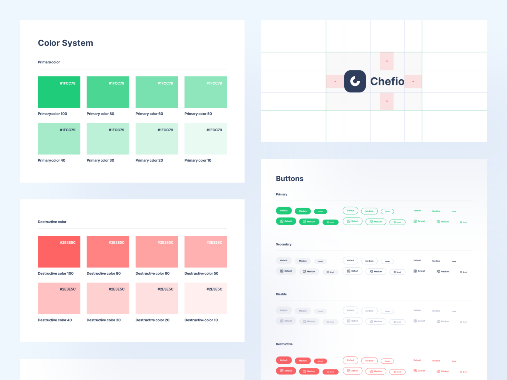
A UI kit is crucial for maintaining design consistency in a software system. It includes components like buttons, icons, typography, and color schemes, creating a visually cohesive and user-friendly experience.
So we deign Chefio, a comprehensive UI kit designed with the primary objective of simplifying the lives of UI/UX designers. Chefio is more than just a design system app; it’s a creative partner for designers, striving to streamline their workflow and elevate their design projects. With Chefio, designers can seamlessly implement design elements, ensuring that every button, icon, font, and color scheme adheres to a predetermined aesthetic.
The advantages of Chefio extend far beyond its convenience and simplicity. By providing a single source of truth for design components, it minimizes the chances of inconsistencies and haphazard design choices. Users will find the app more intuitive and easy to navigate, thanks to the consistent visual language Chefio instills.
If you’re looking to create a design kit as impressive as Chefio, talk with us. Keitoto Studio is your creative ally, ready to collaborate with you in turning your design vision into a stunning reality. We commitment to precision help you craft the perfect design kit tailored to your specific project.
A well-structured design system UI kit is a cornerstone for UI/UX designers. This is why we proudly introduce Chefio, a comprehensive design system app UI kit that addresses the fundamental needs of designers. Chefio’s significance lies in its ability to maintain consistency throughout the design process, ultimately elevating efficiency and user experience.
In the dynamic world of app development, consistency is key. Chefio provides a standardized set of design elements, including buttons, icons, typography, and color schemes, ensuring that every aspect of your app aligns with a cohesive visual language. This not only streamlines the design process but also enhances the user experience, making your app more intuitive and user-friendly.
For design and development teams, Chefio is an invaluable resource. It fosters collaboration and ensures that everyone is on the same page when it comes to design elements, which, in turn, contributes to a harmonious and professional end product. Moreover, Chefio’s scalability ensures that your app will remain adaptable and maintain its quality in the long run.
If you’re eager to establish a design system that guarantees your app’s success and cohesiveness, Keitoto is your ideal partner. Our dedicated design studio agency is committed to bringing your unique vision to life. Let’s discuss your project today and unlock the full potential of your app’s design.
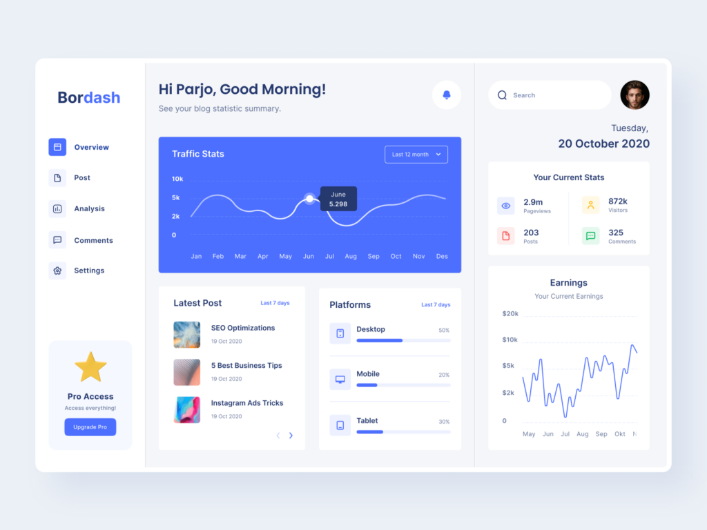
Having a streamlined dashboard is essential for blogger. So we design Bordash, a user-friendly design blog dashboard that empowers bloggers to effortlessly manage their online presence. Bordash offers a comprehensive suite of features, making it the go-to platform for bloggers seeking efficiency and convenience.
One of Bordash’s standout features is its ability to provide users with a snapshot of their website’s performance. This invaluable data equips bloggers with insights to refine their content strategy and optimize their website’s performance.
Not only does Bordash excel in statistics and analytics, but it also streamlines the content creation process. With the platform, users can seamlessly create, edit, and schedule posts, ensuring a steady stream of fresh content for their audience. This scheduling feature allows bloggers to maintain consistency and engagement with their readers, even during busy periods.
The user-centric design of Bordash is another highlight. The choice of white and violet as the dominant colors exudes a modern and clean aesthetic. This design choice not only makes the dashboard visually pleasing but also ensures a clear and easy-to-navigate user interface. Bloggers can now focus on their content, without the distraction of a cluttered or complicated dashboard.
Ready to create a customized dashboard design like Bordash? Elevate your user experience with Keitoto Studio. Let’s bring your vision to life. Contact us today!
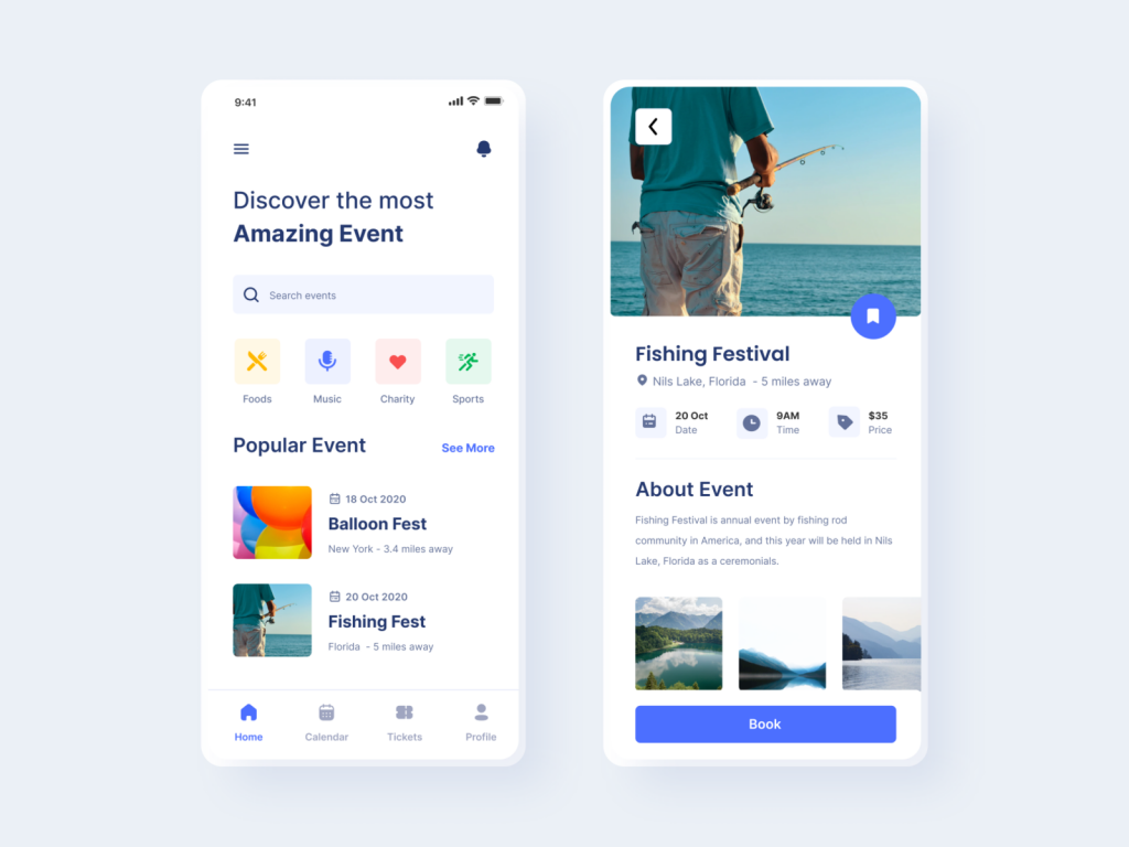
Event Finder Mobile App Exploration is a dynamic tool that caters to a wide range of interests. Whether you’re a foodie looking for culinary events, a music lover in search of the next concert, a charity enthusiast seeking opportunities to give back, or a sports fanatic wanting to catch the latest game, this app has you covered. We design it to provides a wealth of information about popular events and seamlessly connects users with the events that align with their interests and location.
Key features of the Event Finder include event listings, detailed descriptions, ticket booking options, and event reminders, ensuring that users never miss out on exciting opportunities. The app also incorporates user reviews and ratings, offering valuable insights into the quality and experience of each event.
The visual appeal and user-friendliness of this app are second to none. With a well-thought-out and intuitive interface, users can effortlessly navigate through event categories, filter results, and access essential details. The design not only enhances user experience but also reflects the app’s modernity and professionalism.
Ready to elevate your digital presence?
Keitoto Studio Design Agency is the creative partner you need. Discuss with us!
At Keitoto, our journey to create our unique brand identity has been an exciting and rewarding experience.
Our brand identity is defined by two key elements: boldness and the color blue. The boldness in our identity reflects our commitment to pushing boundaries and exploring new horizons. It symbolizes our determination to stand out and make a difference in the creative world.
The color blue, a dominant element holds a special place in our hearts. Blue is often associated with trust, reliability, and professionalism. It also represents creativity and the vastness of the creative landscape we explore every day.
To get a deeper insight into our brand identity and see it in action, visit our website at Keitoto.com. There, you’ll find a showcase of our work, projects, and the essence of our brand. It’s a testament to our commitment to creativity, design, and innovation.
We believe in the power of collaboration and are always excited to work with individuals and organizations that share our passion for creativity and design. If you’re interested in collaborating with us or have any inquiries, don’t hesitate to reach out. You can contact us at hello@keitoto.com, and we’ll be more than happy to explore new possibilities with you.
Hola everyone! Today I publish my first shot on this amazing team. This is about furniture landing page.
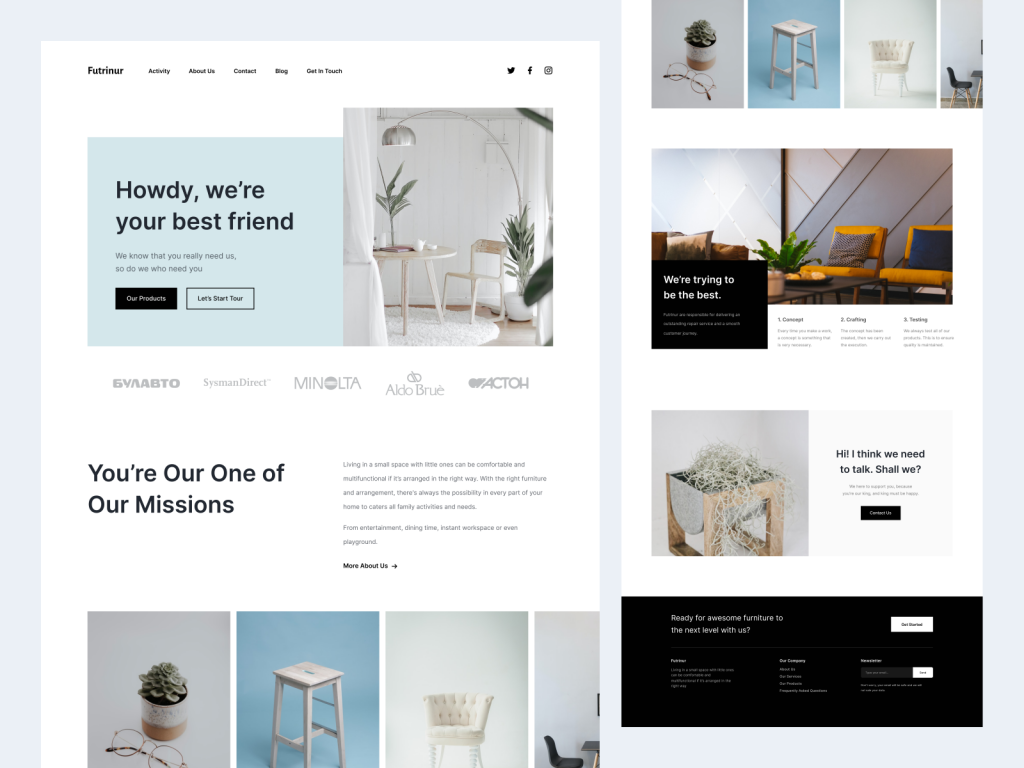
Furnitur: Where Style Meets Function – A Landing Page Design Portfolio
In the world of web design, the magic of creating a visually stunning and user-friendly landing page is an art in itself. Today, we introduce you to “Furnitur,” a representative furniture website landing page that seamlessly blends aesthetic appeal with functionality.
The Allure of Furnitur Landing Page
Furnitur is more than just a landing page; it’s an experience in itself. Let’s take a closer look at what sets this design apart:
Homepage Extravaganza
The homepage of Furnitur is a visual feast, adorned with captivating images of exquisite furniture products. It is designed to spark the visitor’s interest and create an immediate connection with the world of furniture. The clear color scheme and stunning visuals combine to create an inviting and immersive atmosphere.
Table of Contact:
In the world of web design, convenience is key. Furnitur ensures that visitors can easily get in touch with the team. The table of contact is strategically placed, making it effortless for visitors to initiate contact and engage with the brand.
Activity Page:
Explore the depth of Furnitur’s offerings on the activity page. Here, you’ll discover a variety of furniture-related activities, creating a dynamic and engaging experience for visitors. The design ensures that every element is both aesthetically pleasing and highly functional.
About Us Page:
Transparency and trust are paramount in the world of e-commerce. Furnitur’s “About Us” page is thoughtfully designed to introduce the brand, its values, and its commitment to providing top-quality furniture. The visitor gets a glimpse of the people and passion behind the products.
Contact Page:
While the table of contact offers quick access, the dedicated contact page provides an in-depth opportunity for visitors to reach out. With a user-friendly interface, visitors can easily submit inquiries or messages, ensuring a seamless communication process.
Blog Page:
For those seeking inspiration, the blog page offers a treasure trove of insights and ideas related to furniture. The visually engaging layout, along with clear typography, makes reading a pleasure.
Get in Touch Page:
Furnitur takes visitor engagement seriously. The “Get in Touch” page is designed to facilitate a deeper connection between the brand and the visitor. Whether it’s inquiries, feedback, or collaboration opportunities, this page ensures a smooth and satisfying experience.
Create Your Stunning Landing Page Design
If you’re inspired by Furnitur’s impeccable design and wish to create a landing page that captivates your audience, look no further than Keitoto Studio Design Agency. Our team of experts specializes in crafting user-friendly, visually appealing, and highly functional landing pages that make a lasting impact. Transform your digital presence and build a landing page website like Furnitur with Keitoto Studio Design Agency. Elevate your brand and engage your audience with the magic of web design today.
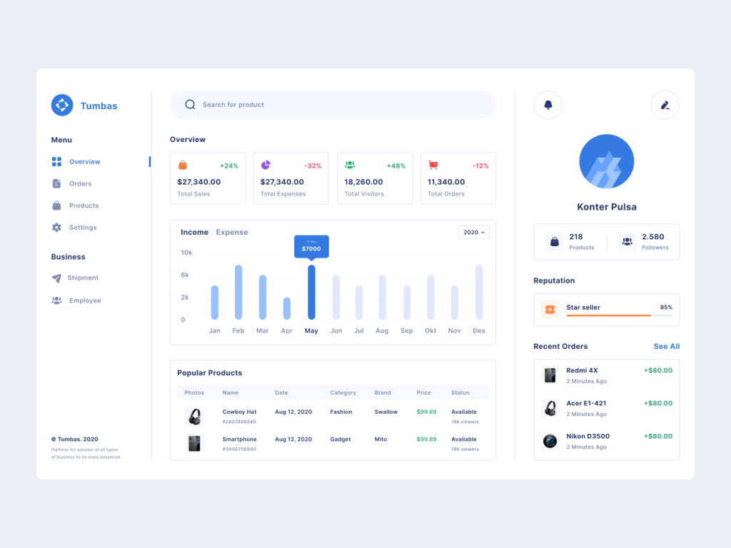
In the fast-paced world of sales, understanding your business’s performance is the key to success. Enter Tumbas, the sales analytics dashboard that takes your data representation to a whole new level. Tumbas is not just a dashboard; it’s a powerful tool that provides an insightful overview of your sales, helping you make informed decisions and transform your business.
Tumbas: Unveiling a World of Data
Let’s explore what Tumbas brings to the table:
Overview Page: The heartbeat of Tumbas, the overview page offers a comprehensive snapshot of your business. With a sleek and intuitive design, users can easily navigate the overview page and access essential information at a glance. Here, they can search for products, view graphics representing total sales, expenses, visitors, and orders, and gain insights into their monthly income and expenses.
Best-Selling Products: With a stunning visual percentage representation of your income and expenses for the month, Tumbas helps you identify trends and areas that need attention. The elegant color schemes and typography used make this data both informative and visually appealing.
Your Profile: Know thyself and your business. Tumbas provides users with a space to see their profile, count their product sales, monitor their reputation, and view recent orders. With Tumbas, it’s not just about data; it’s about a holistic understanding of your business and personal growth.
Order Management: Another page is dedicated to efficiently managing orders, ensuring that you stay on top of your sales processes with ease.
Product Management: Tumbas empowers you to take control of your product inventory. Manage, update, and optimize your product listings efficiently.
Settings Menu: Customize your website setup in a breeze with the settings menu. Tumbas ensures that the user experience is smooth and user-friendly, right from the get-go.
Shipment and Employee Management: Provide seamless shipping solutions and manage your workforce effortlessly through dedicated pages, enabling a smooth operation of your business.
Unlock the Potential with Tumbas
If you’re inspired by the potential of Tumbas and wish to transform your sales analytics,Keitoto.com ideal partner. Our team of experts can help you build a website analytics dashboard like Tumbas, tailored to your unique business needs. With a user-friendly, visually engaging, and insightful design, you can make informed decisions that drive success. Unleash the power of Tumbas with Keitoto.com and elevate your sales game today.
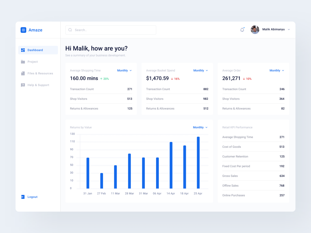
Hola everyone! So this is called Amaze. An web-app/dashboard design for tracking KPI data.
Amaze Design: Transforming Your Web KPI Data Experience
In the ever-evolving world of web analytics, having a powerful and visually appealing data representation is crucial. Amaze Design is here to redefine the way you interact with your Key Performance Indicators (KPIs). This innovative design not only delivers insightful data but also enhances your web experience through well-thought-out color schemes, typography, and user-friendly features.
The Anatomy of Amaze Design
Amaze Design is not your run-of-the-mill KPI dashboard; it’s a complete transformation of your data experience. Let’s dive into what makes Amaze stand out:
Dashboard with Search Tools
Amaze starts strong with an intuitive dashboard equipped with powerful search tools. Easily find the information you need, making data exploration a breeze. The design ensures that the dashboard’s color schemes are inviting, making your data visually engaging.
Averaging Shopping Time Graphics
Understanding customer behavior is crucial. Amaze provides you with graphics that help you analyze and optimize your customers’ shopping time. The typography used in these graphics ensures that the data is presented clearly and legibly.
Averaging Basket Spends Graphics
Dive into your customers’ spending habits with Amaze’s averaging basket spends graphics. The color schemes used make it easy to spot trends and make informed decisions.
Average Order Data
Get a holistic view of your business with average order data representation. The user-friendly design ensures you can extract valuable insights without a steep learning curve.
Retail Key Performance Graphics
Track and visualize your retail performance with ease. The color schemes used are not only visually appealing but also designed to highlight the key aspects you need to focus on.
Returns by Value Graphics
Manage returns effectively with returns by value graphics. The typography and color schemes make it easy to understand the data and take necessary actions.
Beyond KPIs: Streamline Your Business
Amaze Design isn’t just about data; it’s a comprehensive platform to manage your business projects. With dedicated pages for project management, file storage, and resources, Amaze takes your business operations to the next level. The color schemes and user-friendly interfaces ensure that you can navigate these features effortlessly.
Help and Support at Your Fingertips
Sometimes, we all need a helping hand. Amaze Design’s help and support page is designed with the user in mind. The typography ensures that you can find answers and assistance with ease, all wrapped in a visually pleasing color scheme.
Transform Your Web KPI Experience
If you’re inspired by Amaze Design and want to build a website with a similar impact, look no further than Keitoto.com. Our team of experts can help you bring your vision to life, ensuring a user-friendly, visually engaging, and insightful design that matches your business needs. Transform your web KPI data experience today with Keitoto.
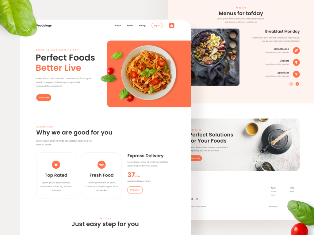
Foodology – Landing Page UI Kit. It is a food landing page UI kit with a 10 screen + and mobile responsive design. Are you food enthusiast? Let’s dive into what we explore in Foodology
The Appetizing Concept Behind Foodology
Food is more than just sustenance; it’s a reflection of our identity, culture, and even our personality. Don’t worry if you are comfort food enthusiast, a risk-taker with spicy dishes, or an adventurous eate Foodology delves deep into this intriguing connection between what we eat and who we are. First things first we want to frame foodology on your expectation like this:
What to Expect from Foodology
10-Screen Mobile-Responsive Design:
Foodology’s UI kit provides a comprehensive design solution for a landing page that seamlessly adapts to various devices, ensuring that your visitors have an optimal experience, whether they’re on a smartphone, tablet, or desktop.
Exploring Food and Personality
Foodology can help users find answers and explore these intriguing connections.
Self-Discovery
The landing page encourages self-reflection and provides users with insights into their culinary inclinations. By understanding the psychology behind their food choices, users can gain a deeper insight into their own behaviors and motivations.
Inspiration and Empowerment
Foodology isn’t just about finding out your food personality; it’s about using that knowledge to inspire personal growth and empowerment. By connecting food choices to personality traits, users can make informed decisions and take action to lead a more fulfilling life.
Predictive Insights
By recognizing how food choices influence behavior, you can leverage this knowledge to be more effective, productive, and successful in various aspects of your life, whether it’s in your career, relationships, or personal development.
Ease of Shopping
In addition to enhancing the user experience through meal planning, Foodology also offers the convenience of ordering food online from ouur curated and recommend menu selections.
Designing the Foodology Experience
The layout is designed to be visually appealing, user-friendly, and easy to navigate. The dominant orange and white color scheme, along with carefully chosen typography and graphics, is tailored to create a warm and inviting atmosphere that encourages users to explore the site and discover more about themselves through the lens of food.
Ready to bring your vision to life? Join with Keitoto.com and turn your ideas into stunning graphics!
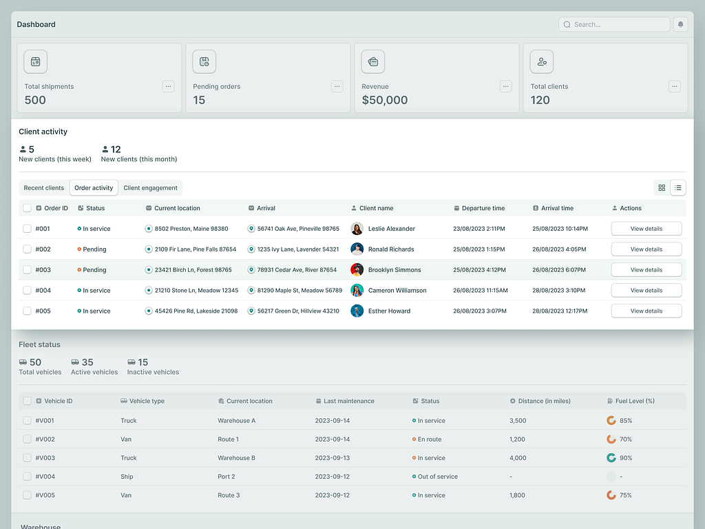
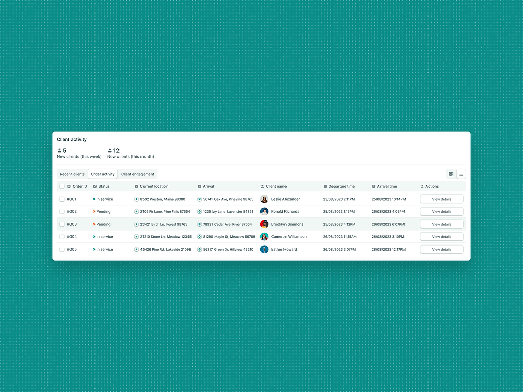
Design in Logistics Tools: The ShipTrack Experience
Design in Logistic tools is crucial, all-in-one solution has revolutionized the way businesses handle shipments, transforming complex logistics into a streamlined and intuitive process. We commitment to exceptional design that places user experience at the forefront. We Proudly announce “ShipTrack”
Simplifying Logistics through Design:
ShipTrack is more than just a logistics management tool; it’s a design masterpiece. From the moment you lay eyes on its user interface, you’ll understand the value of well-crafted design. The intuitive controls are a testament to the thought put into user-friendliness, ensuring that every user, regardless of their technical expertise, can navigate the platform effortlessly. This intuitive approach is a game-changer in simplifying the complexities of logistics.
Real-Time Tracking and Optimization:
At the heart of ShipTrack’s design is the real-time tracking feature. With a few clicks, you can monitor the progress of your shipments, ensuring full transparency and control. What’s more, the design incorporates route optimization capabilities, allowing you to maximize efficiency and reduce costs. These features aren’t just functional; they are designed to enhance your decision-making and operational excellence.
Design-Driven Analytics:
One of ShipTrack’s standout features is its detailed analytics. Here, design isn’t just about aesthetics; it’s about providing actionable insights. The visually appealing, data-rich dashboards empower you with the information you need to make informed decisions, whether it’s adjusting routes, optimizing processes, or predicting future logistics needs.
Client Management Made Easy:
The robust client management features within ShipTrack are another testament to its design prowess. Keeping track of clients, their preferences, and shipment histories is a breeze. Every interaction is designed to be efficient, ensuring that your relationships with clients remain strong and hassle-free.
Conclusion and the Call to Action:
In the world of logistics, design isn’t just about making things look good; it’s about making operations work seamlessly. ShipTrack embodies this philosophy, using design to simplify the complexities of cargo management. The value of design in logistics cannot be overstated, and ShipTrack is a prime example of how it can elevate your shipping game.
As you consider the significance of design in logistics, perhaps it’s time for you to embark on your journey to create a design-centric SaaS solution like ShipTrack. Revolutionize an industry and simplify operations by putting user experience and design at the forefront. The logistics world is waiting for the next innovative solution. Will it be yours?