
Statistic Manager Landing Page

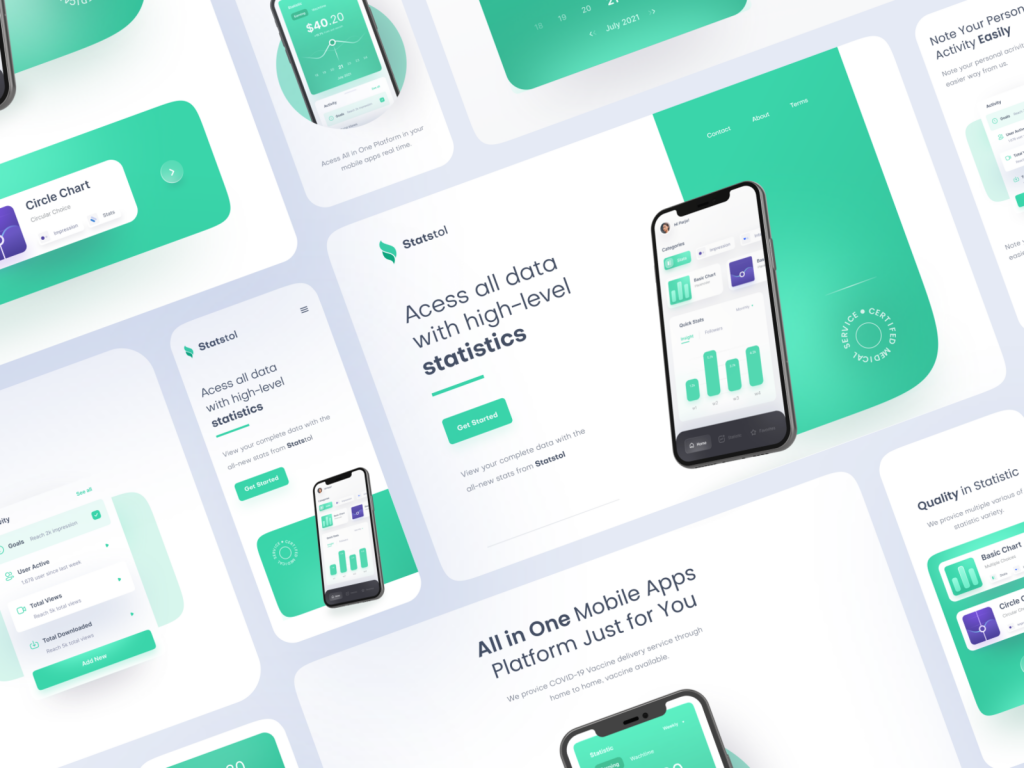
Statistic Manager Landing Page emerges as a hub for precision and clarity. This article takes you on a journey through the key features and design elements of the Statistic Manager Landing Page, highlighting its role as a central command center for data analysis and management.

A Gateway to Insights:

The Statistic Manager Landing Page is more than just a virtual doorstep; it’s the entrance to a world of data insights. As organizations grapple with increasing volumes of information, this landing page becomes the focal point for professionals seeking to navigate, analyze, and extract meaning from their statistical data.

Key Features of the Statistic Manager Landing Page:

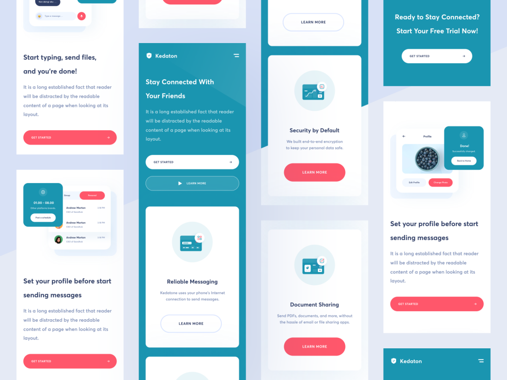
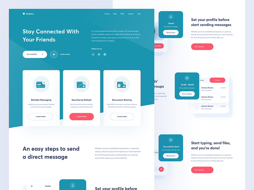
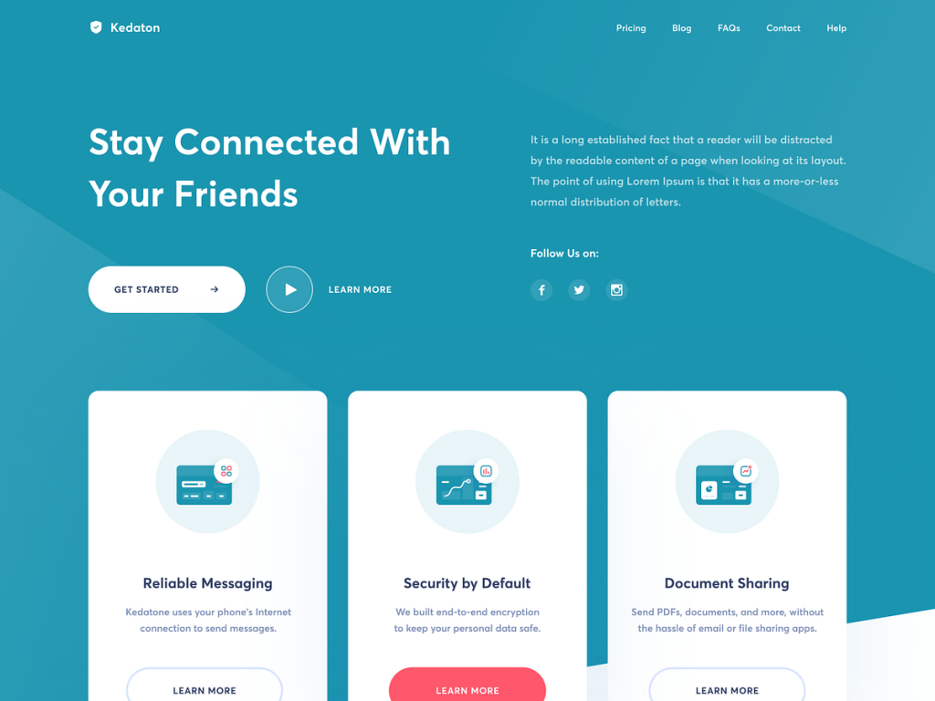
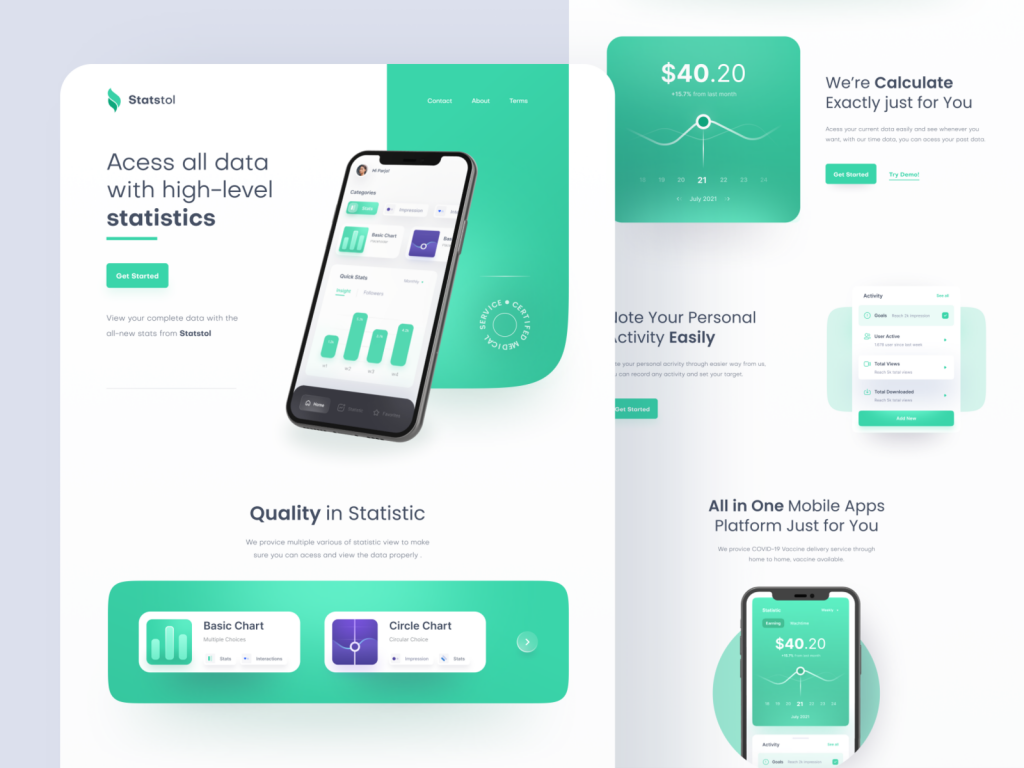
Intuitive Dashboard:

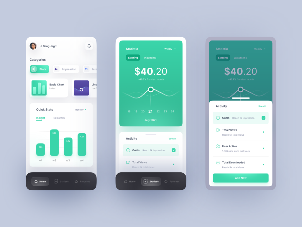
The landing page boasts an intuitive dashboard that serves as a visual command center. Users are greeted with a snapshot of key statistics and data trends, allowing for quick assessments and informed decision-making.

Customizable Widgets:

    Recognizing that each user has unique analytical needs, the Statistic Manager Landing Page offers customizable widgets. Users can arrange and prioritize statistical elements, ensuring that the most relevant information is readily accessible.

    Real-time Data Updates:

    Staying true to the pace of the digital age, the landing page provides real-time data updates. Users can trust that the information they see is current, enabling them to respond swiftly to evolving trends and patterns.

    Graphical Representations:

      The power of visualization is harnessed through graphical representations of data. Charts, graphs, and visual elements transform complex statistical information into comprehensible and actionable insights.

      Design Elements for Clarity:

      Clean and Minimalist Interface:

      Clarity is paramount in the Statistic Manager Landing Page design. A clean and minimalist interface ensures that users can focus on the data without unnecessary distractions, fostering a more productive and enjoyable user experience.

      Color-Coding for Data Categories:

        To aid in quick recognition and interpretation, data categories are color-coded. This design choice simplifies the process of identifying different types of statistics and adds a layer of visual organization to the landing page.

        User-Friendly Navigation:

        User-friendliness is a cornerstone of the landing page design. Navigational elements are strategically placed, allowing users to move seamlessly between different sections and explore various statistical dimensions effortlessly.

          Security and Privacy Considerations:

          Robust Data Security:

          Understanding the sensitivity of statistical data, the landing page incorporates robust security measures. Encryption protocols and secure access mechanisms ensure that confidential information remains protected.

          User Permissions and Access Controls:

          The design includes granular user permissions and access controls. Organizations can tailor access levels, ensuring that users only see and interact with the statistical data relevant to their roles and responsibilities.

            Integration for Seamless Workflow:

            Connectivity with Analytics Tools:

            The Statistic Manager Landing Page is designed to integrate seamlessly with popular analytics tools. This connectivity allows users to leverage advanced analytics functionalities without leaving the landing page environment.

            Export and Share Features:

            Recognizing the collaborative nature of data analysis, the landing page includes export and share features. Users can export data, generate reports, and share insights with team members, fostering a culture of collaboration.

            Future Developments and Continuous Improvement:

            The Statistic Manager Landing Page is not static; it’s a dynamic tool that evolves with the needs of data analysts and decision-makers. Continuous feedback, user insights, and emerging trends will inform future developments, ensuring that the landing page remains at the forefront of statistical data management.

            Want to collaborate? Email Us: hello@keitoto.com

            Keitoto.com, top notch UI/UX design team dedicated for your Business.

            Statistic Manager Landing Page Responsive Version

            Statistic Manager Landing Page Responsive Version

            Statistic Manager landing page takes a significant leap forward with its responsive design. This article explores the enhancements brought about by the responsive version of the landing page, focusing on how it elevates user experience and ensures seamless accessibility across a variety of devices.

            Statistic Manager Embracing Responsiveness for User-Centricity:

            The Statistic Manager landing page has undergone a transformative journey to embrace responsiveness. Recognizing the diverse ways users access information, the responsive version ensures that the landing page adapts dynamically to different screen sizes, making data and analytics more accessible than ever before.

            Key Features of the Responsive Version:

            Flexible Grid Layout:

            The responsive design introduces a flexible grid layout that automatically adjusts based on the screen size. This ensures that users on desktops, tablets, and smartphones have a consistent and visually pleasing experience.

            Adaptive Navigation:

            Navigating the Statistic Manager landing page is now a breeze on any device. The navigation elements intelligently adjust, maintaining ease of use while optimizing space, whether it’s a large desktop screen or the compact display of a mobile device.

            Optimized Visual Elements:

            Graphs, charts, and other visual elements are optimized for clarity and responsiveness. The design ensures that users can interact with and interpret data seamlessly, regardless of the device they are using.

            Streamlined Information Hierarchy:

            The responsive version maintains a streamlined information hierarchy. Whether viewing detailed statistics on a large screen or quickly checking key metrics on a smartphone, users can effortlessly access the information they need.

            Enhanced User Experience Across Devices:

            Desktop Experience:

            On larger screens, the Statistic Manager landing page takes advantage of the expansive space to present detailed analytics, graphs, and data. The responsive design ensures that users can leverage the full power of their desktop environment for in-depth analysis.

            Statistic Manager Tablet Adaptability:

            Tablets offer a balance between mobility and screen size. The responsive version optimizes the layout for tablets, providing a comfortable and immersive experience for users who prefer a touch interface for their data exploration.

            Statistic Manager Mobile Accessibility:

            The true test of responsiveness lies in the mobile experience. The Statistic Manager landing page’s responsive design ensures that users can access key statistics, navigate through data sets, and make informed decisions—all from the convenience of their mobile devices.

            Usability and Accessibility Considerations:

            Statistic Manager Touch-Friendly Interactions:

            The responsive version introduces touch-friendly interactions for mobile and tablet users. This includes gestures, swipes, and taps that make exploring data on touch-enabled devices intuitive and user-friendly.

            Statistic Manager Loading Time Optimization:

            Recognizing the varied internet speeds on different devices, the responsive design optimizes loading times. Users, regardless of their connection, experience swift access to vital statistics and analytics.

            Incorporating User Feedback:

            The evolution to a responsive landing page is not just a technological upgrade; it’s a response to user needs. Regular feedback and user testing have played a crucial role in shaping the responsive design, ensuring that it aligns with user expectations and preferences.

            Future Iterations and Continuous Improvement:

            The journey of the Statistic Manager landing page doesn’t end with its responsive version. Continuous improvement is the ethos, with future iterations promising further refinements, additional features, and a commitment to staying at the forefront of responsive design trends.

            Want to collaborate? Email Us: hello@keitoto.com

            or visit our web Keitoto Portfolio Keitoto

            Learning Platfrom Animated Version Design

            Learning Platform Animated Version dynamic online space that not only facilitates interactive but also introduces a vibrant and engaging animated interface. This article takes you on a tour through the features and design philosophy of this animated experience, destined to be showcased proudly in a designer’s portfolio.

            Dynamic Learning, Dynamic Design:

            The Animated Version of the Learning Platform is not just a virtual classroom; it’s an immersive educational experience brought to life through animation. This platform seamlessly integrates the functionalities of online learning with a visually compelling animated design, creating an environment that resonates with learners of all ages.

            Key Features of the Animated Learning Platform:

            Real-time Communication:

            The platform goes beyond traditional by incorporating real-time communication features. Users can chat with classmates and mentors instantly, fostering a sense of community and collaboration.

            Interactive Animated Learning Interface:

            Say goodbye to static interfaces. The Animated Learning Platform introduces a dynamic and interactive design that responds to user actions. Animations guide users through the platform, making the learning journey not just informative but also visually engaging.

            Mobile Learning Video Playback:

            Recognizing the flexibility of mobile, the platform allows users to seamlessly play learning videos on their mobile devices. Whether on a bus, at home, or during a break, users can access educational content anytime, anywhere.

            Personalized Avatars:

            Avatars add a touch of personalization to the learning experience. Users can create animated avatars that represent them in the virtual classroom, enhancing the sense of identity and individuality within the platform.

            Animated Learning in Action:

            Animated Learning Lectures:

            Traditional lectures get a vibrant makeover with animated visuals. Concepts come to life through dynamic animations, making complex topics more accessible and engaging.

            Animated Conversations:

            Chatting with classmates and mentors becomes a lively experience with animated conversations. Emoticons and reactions are not just static icons; they dance and express emotions, creating a more dynamic communication environment.

            Animated Progress Tracking:

            Monitoring progress becomes a visually rewarding experience. Users can track their journey through animated progress bars, achievements, and interactive visuals that celebrate milestones.

            Designed for Impact:

            Visual Appeal and Accessibility:

            The Animated Version prioritizes visual appeal without compromising accessibility. The animations are carefully designed to enhance comprehension and engagement, ensuring that learners of diverse backgrounds can benefit.

            Usability Across Devices:

            The platform is crafted to offer a seamless experience across devices. From desktops to tablets and smartphones, users can enjoy the animated experience without compromising functionality.

            Future Iterations and Continuous Innovation:

            As technology evolves and educational paradigms shift, the Animated Platform remains committed to continuous innovation. Future iterations will introduce new animated features, interactive elements, and design refinements to stay at the forefront of the dynamic landscape.

            Want to collaborate? Email Us: hello@keitoto.com

            or visit our web Keitoto Portfolio Keitoto

            MEKKY’s Landing Page Home Design

            MEKKY's Landing Page Home Design

            MEKKY’s Landing Page Home Design emerges as a masterpiece that seamlessly marries simplicity with elegance. This article takes you on a journey through the intricacies of design philosophy, drawing inspiration from the clean and sophisticated style synonymous with the Balkan Brothers.

            MEKKY’s Landing Page Home Design Essence of Clean Elegance:

            Landing page home design epitomizes clean elegance, a design ethos that resonates with the cultural richness of the Balkan Brothers. Drawing inspiration from the region’s aesthetic sensibilities, the design strikes a harmonious balance between minimalism and sophistication.

            Landing Page Home Design Key Elements

            MEKKY’s Landing Page Home Design Sleek Navigation:

            MEKKY’s design places a premium on a sleek and intuitive navigation experience. Users are greeted with a clear and uncluttered menu that seamlessly guides them through the various sections of the landing page. This design choice ensures that visitors can effortlessly explore the offerings without unnecessary distractions.

            MEKKY’s Landing Page Home Design Inspired Visual Elements:

            The visual elements on MEKKY’s landing page are a nod to the Balkan Brothers’ penchant for combining traditional aesthetics with a modern twist. Clean lines, high-quality imagery, and a carefully chosen color palette create a visually appealing and culturally resonant experience.

            Balanced Typography:

            Typography plays a pivotal role in MEKKY’s design, reflecting a commitment to clarity and readability. The choice of fonts is deliberate, striking a balance between modernity and a touch of cultural authenticity inspired by the Balkan Brothers.

            Engaging Call-to-Action (CTA):

            MEKKY’s landing page is designed with user engagement in mind. Strategic placement of CTAs encourages visitors to take specific actions, whether it’s exploring a product, subscribing to a newsletter, or embarking on a journey through the site’s content.

            Cultural Inspirations from the Balkan Brothers:

            Timeless Simplicity:

            The clean style adopted by MEKKY is reminiscent of the Balkan Brothers’ timeless simplicity. It reflects a commitment to conveying a message or showcasing a product without unnecessary embellishments, allowing the content to shine.

            Elegance in Minimalism:

            Balkan design often embraces minimalism as a form of elegance. MEKKY’s landing page home design channels this ethos by using space wisely, ensuring that every element serves a purpose, and avoiding unnecessary visual clutter.

            Cultural Nuances in Design Elements:

            MEKKY pays homage to the Balkan Brothers by subtly incorporating cultural nuances into the design elements. This might include patterns, motifs, or color choices that echo the rich heritage of the region.

            User-Centric Design:

            MEKKY’s landing page is not just visually stunning; it is inherently user-centric. The design facilitates a seamless user experience, ensuring that visitors can quickly find what they’re looking for while enjoying the aesthetics inspired by Balkan design principles.

            Continuous Refinement and Evolution:

            MEKKY’s commitment to excellence is reflected in its approach to design evolution. Regular refinements, informed by user feedback and emerging design trends, ensure that the landing page remains a dynamic and engaging entry point for visitors.

            Want to collaborate? Email Us: hello@keitoto.com

            or visit our web Keitoto Portfolio Keitoto

            Insight Statistical Mobile App Exploration

            Insight Statistical mobile app emerges as a sophisticated tool tailored for users engaged in social media analytics. Designed to provide comprehensive insights, this app empowers users to navigate through weekly analytics, follower trends, watch time metrics, and even set ambitious goals for their online presence.

            Visual Insight Empowering Users

            The crux of the Insight Statistical app lies in its ability to transform complex data into visually compelling insights.

            Insight Key Features and Functionalities:

            Weekly Insight Graphics:

            • Users can delve into weekly performance analytics through intuitive graphics. Whether it’s tracking engagement rates, post reach, or the evolution of key metrics, the weekly insights keep users informed about their social media performance trends.

            Follower Graphics:

            • Visualizing follower trends is made easy with dynamic graphics. Users can understand the growth patterns of their followers, identify spikes or declines, and make informed decisions to enhance their online reach.

            Watch Time Metrics:

            • For content creators and influencers, watch time is a critical metric. The app provides detailed graphics showcasing the watch time trends, allowing users to analyze which content resonates most with their audience and tailor their strategies accordingly.

            Goal Setting Functionality:

            • Setting and tracking goals is seamlessly integrated into the app. Users can establish objectives for follower growth, engagement rates, or watch time and receive regular updates on their progress. This goal-setting feature serves as a motivational tool, encouraging users to strive for continuous improvement.

            Innovative Design Elements:

            Intuitive User Interface:

            • The app boasts an intuitive and user-friendly interface, ensuring that even users with limited experience in analytics can navigate through its features effortlessly. Clarity and simplicity are at the core of its design, making it accessible to a broad audience.

            Customizable Dashboards:

            • Recognizing that different users have distinct preferences, Insight Statistical allows for customizable dashboards. Users can arrange and prioritize the statistics that matter most to them, tailoring the app to their specific analytical needs.

            Real-Time Updates:

            • To keep users on the pulse of their social media performance, the app offers real-time updates. This ensures that users are equipped with the latest insights, allowing for swift decision-making in the ever-evolving landscape of social media.

            Insight Visual Fostering Informed Decision-Making:

            The primary goal of Insight Statistical is to empower users with the knowledge needed to make informed decisions. Whether it’s refining content strategies, identifying peak engagement times, or setting ambitious goals, this app serves as a comprehensive tool for enhancing social media presence.

            Future Vision:

            As the social media landscape continues to evolve, Insight Statistical is committed to staying at the forefront of innovation. The app’s designers are dedicated to incorporating user feedback and exploring new features to ensure that it remains an indispensable tool for social media analytics enthusiasts.

            The Insight Statistical mobile app is more than a tool; it’s a gateway to understanding the nuances of social media engagement. Through its sophisticated design and user-centric features, the app empowers users to navigate the intricacies of analytics with ease.

            hello@keitoto.com

            Keitoto.com, top notch UI/UX design team dedicated for your Business.

            Gapay – Finance Mobile App

            Gapay-Finance mobile app emerges as a beacon of simplicity and efficiency. This innovative app is designed to empower users by providing a seamless platform for various transactions, from transfers and bill payments to insightful visualizations of their income and expenses. Let’s delve into the key features and design elements that make Gapay-Finance a game-changer in the world of mobile finance.

            Gapay Streamlined Transactions with a Single Click:

            Gapay-Finance recognizes the importance of time and efficiency in financial transactions. The app’s design revolves around a user-friendly interface that enables users to perform various transactions effortlessly with just a single click. Whether it’s transferring funds to a friend, receiving payments, or settling bills, Gapay-Finance simplifies the process, putting financial control at users’ fingertips.

            Gapay Visualizing Financial Health:

            One standout feature of Gapay-Finance is its ability to provide users with a clear and visual representation of their financial health. Through intuitive graphics, users can easily track their income and expenses throughout the month. This visual representation goes beyond mere numbers, offering a comprehensive overview that aids users in making informed financial decisions.

            Gapay Key Design Elements:

            1. User-Friendly Interface:
              • The app boasts a clean and user-friendly interface, ensuring that users can navigate through its features effortlessly. Intuitive design elements guide users through the various functionalities, making it accessible for users of all levels of tech-savviness.
            2. One-Click Transactions:
              • The central theme of Gapay-Finance’s design is simplicity. Each transaction is strategically placed and easily accessible, minimizing the steps needed to complete any financial activity. This one-click functionality not only saves time but also enhances the overall user experience.
            3. Interactive Graphics:
              • The graphical representation of income and expenses is interactive and dynamic. Users can drill down into specific categories, view trends, and gain valuable insights into their spending habits. This feature transforms financial data into a visual story, fostering a deeper understanding of personal finance.
            4. Secure and Intuitive Authentication:
              • Gapay-Finance prioritizes security without compromising on user experience. The authentication process is both robust and intuitive, ensuring that users feel confident about the safety of their financial transactions.

            Gapay Empowering Financial Independence:

            Gapay-Finance is not just a mobile app; it’s a tool designed to empower users to take control of their financial journey. By simplifying transactions and providing insightful visualizations, the app encourages financial literacy and responsible spending.

            Future Innovations:

            As technology advances, Gapay-Finance remains committed to staying ahead of the curve. Continuous updates and future innovations are on the horizon, promising an even more refined and feature-rich mobile finance experience.

            Conclusion:

            In the landscape of mobile finance, Gapay-Finance stands out as a beacon of design excellence and user-centric functionality. By enabling seamless transactions and offering a visual representation of financial data, the app not only simplifies the financial lives of users but also empowers them to make informed decisions. Gapay-Finance is not just an app; it’s a partner in financial well-being, seamlessly blending design and functionality for a transformative user experience.

            Want to collaborate? Email Us: hello@keitoto.com

            Keitoto.com, top notch UI/UX design team dedicated for your Business.

            Responsive Design For Website – Kedaton

            Responsive design has been implemented on the Kedaton website, ensuring accessibility and functionality across a diverse range of devices

            Responsive Design understanding

            In a world where users access websites from various devices, responsiveness is not just a feature; it’s a necessity. Kedaton recognizes that users engage with the platform on smartphones, tablets, and desktops, and the design ensures a consistent and optimal experience regardless of the screen size.

            Key Features of Kedaton’s Responsive Design:

            1. Adaptable Layout:
              • The website now boasts an adaptable layout that seamlessly adjusts to different screen sizes. Whether users are navigating through the platform on a large desktop monitor or a compact smartphone screen, Kedaton’s interface remains intuitive and user-friendly.
            2. Optimized Navigation:
              • The responsive design prioritizes efficient navigation. Menus and buttons are strategically placed and optimized, ensuring that users can effortlessly explore the platform’s features, regardless of the device they are using.
            3. Improved User Engagement:
              • With a focus on responsiveness, Kedaton aims to enhance user engagement. The platform is designed to provide a consistent and visually appealing experience, fostering a deeper connection between users and the messaging features offered by Kedaton.
            4. Visual Consistency:
              • Consistency is key in responsive design, and Kedaton has taken this principle to heart. The visual elements, including colors, fonts, and imagery, maintain uniformity across devices, reinforcing the brand identity and creating a cohesive user experience.

            The Impact on User Accessibility:

            1. Mobile Accessibility:
              • With the rise of mobile usage, Kedaton’s responsive design ensures that users can access the messaging platform effortlessly on their smartphones. The mobile experience is optimized for touch interfaces, making communication on the go a seamless experience.
            2. Tablet-Friendly Interface:
              • Tablet users can now enjoy an interface tailored to their devices, combining the mobility of smartphones with the larger screen real estate of desktops. The responsive design ensures that every feature is easily accessible and visually appealing on tablets.
            3. Desktop Efficiency:
              • Desktop users benefit from a design that maximizes screen space and provides an immersive experience. The responsive design caters to the needs of those who prefer the extensive functionality and convenience of a desktop environment.

            Future Developments and Continuous Improvement:

            Kedaton is committed to the ongoing enhancement of its platform, and the design is just the beginning. Continuous feedback from users will fuel further improvements, ensuring that Kedaton remains at the forefront of user-centric design, adaptability, and technological innovation.

            Want to collaborate? Email Us: hello@keitoto.com

            Keitoto.com, top notch UI/UX design team dedicated for your Business.

            Kedaton – Messaging Platform Mobile Responsive

            Kedaton, the cutting-edge messaging platform, understands this need intimately. This article delves into the innovative design approach taken by Kedaton for its messaging platform website, highlighting the significance of responsive design in enhancing user experience and accessibility.

            Kedaton’s Vision:

            Kedaton is more than just a messaging platform; it’s a hub for seamless communication and connection. To bring this vision to life, Kedaton embarked on the journey of creating a responsive website design, ensuring that users across various devices and screen sizes can access the platform effortlessly.

            The Importance of Responsive Design:

            Responsive design has become a hallmark of modern web development, catering to the diverse ways users access websites. Kedaton recognizes the need for a seamless experience, whether users are accessing the platform from a desktop computer, laptop, tablet, or smartphone. Responsive design ensures that the website adapts dynamically to the user’s device, providing an optimal viewing and interaction experience.

            Key Features of Kedaton’s Responsive Website Design:

            1. Cross-Device Compatibility:
              • Kedaton’s responsive design allows users to access the messaging platform seamlessly on any device. The website adjusts its layout, font sizes, and functionalities to ensure a consistent and user-friendly experience, regardless of the device.
            2. Intuitive Navigation:
              • The responsive design prioritizes intuitive navigation, adapting menu structures and interaction elements to suit the specific requirements of each device. This ensures that users can effortlessly explore the platform and access its features, enhancing overall usability.
            3. Optimized Content Presentation:
              • Kedaton understands the importance of content visibility. The responsive design optimizes the presentation of content, ensuring that users can easily consume information without the need for constant zooming or scrolling, fostering a more engaging and enjoyable experience.
            4. Performance Across Networks:
              • Recognizing that users might access Kedaton in various network conditions, the responsive design focuses on performance optimization. This includes fast loading times, efficient use of data, and an overall smooth experience, regardless of the network speed.

            Visual Appeal and Brand Consistency:

            Kedaton’s responsive design not only prioritizes functionality but also maintains a visually appealing and consistent brand identity across devices. The color schemes, typography, and visual elements seamlessly adapt, ensuring that users experience the platform in a way that aligns with Kedaton’s unique brand.

            User Feedback and Iterative Design:

            Kedaton values user feedback in shaping its platform. The responsive design undergoes continuous refinement based on user insights, ensuring that the website evolves to meet the changing needs and preferences of its diverse user base.

            Kedaton’s responsive website design stands as a beacon of innovation, connecting users seamlessly across the digital landscape.

            Want to collaborate? Email Us: hello@keitoto.com

            or visit our web Keitoto.com

            JemPay’s Design – Web Homepage Landing

            JemPay's Design - Web Homepage Landing

            JemPay’s design evolution, we are proud to introduce the web version of JemPay, a dynamic platform poised to amplify the reach and impact of JemPay’s innovative features.

            JemPay’s design is a testament to the fusion of aesthetics and functionality, offering users a visually appealing and intuitively crafted platform for seamless financial interactions. The design ethos revolves around simplicity, ensuring that users can navigate effortlessly through the interface.

            The user interface is thoughtfully organized, presenting key features in an easily accessible manner. From initiating transactions to monitoring account activity, every aspect of JemPay’s design prioritizes user convenience. The clean and uncluttered layout contributes to a streamlined user experience, allowing individuals to manage their finances with clarity and efficiency.

            The JemPay’s Design Vision Behind the Web Version

            The decision to expand JemPay to the web is rooted in the recognition of the broader audience and enhanced marketing capabilities that come with a versatile platform. At its core, JemPay is designed to streamline the money transfer process, prioritizing speed and efficiency.

            Key Features of JemPay Web:

            Enhanced User Interface (UI):

            The web version features an upgraded UI, providing users with an intuitive and visually pleasing environment. The goal is to create an interface that not only accelerates transactions but also delights users with its simplicity.

            Extended Marketing Capabilities:

            Leveraging the web platform, JemPay can now implement robust marketing strategies.

            Scalability and Accessibility:

            By embracing the web, JemPay ensures scalability and broader accessibility. Users can now access JemPay from a variety of devices, fostering a more inclusive and convenient experience.

            The JemPay’s Design Neatness and Cleanliness Journey:

            JemPay’s design web version is not just about functionality; it’s a testament to the commitment to visual excellence. The clean and neat design principles are ingrained in every pixel, ensuring that users not only accomplish their financial tasks efficiently but also enjoy a visually pleasing interaction.

            Stay tuned Keitoto.com for more updates on JemPay’s design evolution and its continuous pursuit of excellence in user experience and visual aesthetics.

            Want to collaborate? Email Us: hello@keitoto.com

            or visit our web Keitoto Portfolio Keitoto

            Kedaton – Messaging Platform Website

            Kedaton messaging platform emerges as a virtual sanctuary, where staying connected with friends is not just a feature but a seamless and secure experience. As we explore the design elements of the it website, it becomes evident that this platform transcends traditional messaging, offering users reliable communication, robust security features, and the ability to share documents effortlessly.

            Kedaton: A Design for Connection

            Upon entering the Kedaton messaging platform website, users are greeted with a design that radiates warmth and familiarity. The interface is thoughtfully crafted to encourage a sense of community and connectedness, setting the tone for a platform designed to facilitate meaningful interactions.

            Kedaton Reliable Messaging: Seamlessness in Communication

            At the heart of the Kedaton platform is its commitment to reliable messaging. The website design ensures that the messaging interface is intuitive, allowing users to engage in conversations with friends effortlessly. Real-time updates, smooth transitions, and a clean layout contribute to an experience where communication feels natural and uninterrupted.

            Security by Default: Safeguarding Your Conversations

            Security is not an afterthought in the Kedaton platform – it’s a foundational principle. The website design reflects this commitment with security features integrated by default. End-to-end encryption, secure authentication methods, and privacy controls are seamlessly woven into the design, ensuring that users can communicate with confidence, knowing that their conversations are shielded from unauthorized access.

            Document Sharing: Beyond Text, Beyond Boundaries

            Kedaton understands that modern communication extends beyond mere text. The website design incorporates a robust document sharing feature, allowing users to seamlessly exchange files with friends. Whether it’s sharing photos, documents, or other media, transforms messaging into a multimedia experience, enriching the way users connect.

            Kedaton User-Friendly Navigation: Intuitively Stay Connected

            The website design of Kedaton prioritizes user-friendly navigation. From setting up an account to exploring features and engaging in conversations, the interface is designed for seamless user interaction.

            Kedaton Responsive and Accessible: Connecting Anytime, Anywhere

            Kedaton’s website design is not just visually appealing; it’s also responsive and accessible. This flexibility underscores Kedaton’s commitment to making meaningful connections convenient for its users.

            As we navigate the Kedaton messaging platform website, it becomes evident that this is more than just a space for digital conversations; it’s a haven designed for meaningful connections. With a focus on reliable messaging, security by default, document sharing features, user-friendly navigation, and accessibility, it redefines the way friends stay connected in the digital age. Step into the world of Kedaton – where communication is not just a tool; it’s an experience designed for connection and community.

            Want to collaborate? Email Us: hello@keitoto.com

             or visit our website Keitoto.com now!