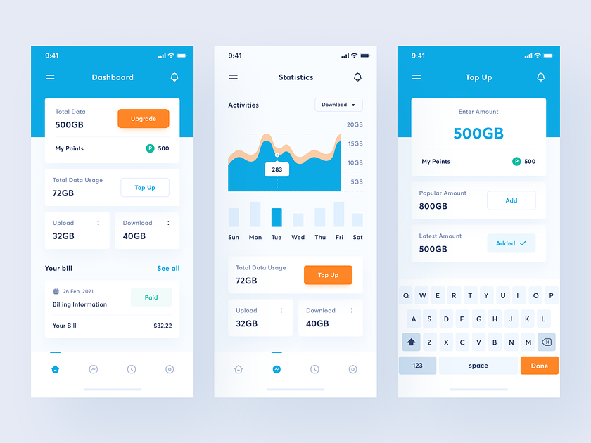
Sales Management App stands as a valuable companion for businesses and individuals. Crafted specifically for mobile usage, this app not only furnishes a detailed snapshot of sales metrics but achieves this with a design that seamlessly combines user-friendly functionality with captivating visuals.
Sales Management App Dashboard Insight: Your Sales at a Glance
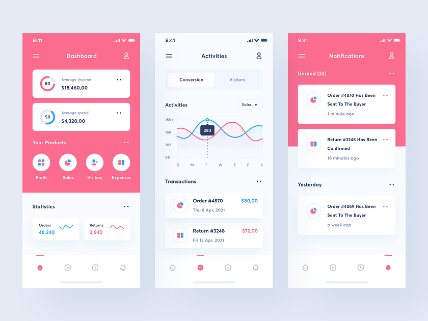
The Sales Management App opens a window into the financial health of your sales activities through an interactive dashboard. Users are greeted with real-time data, displaying essential metrics such as average income, average spending, and other key performance indicators. This visual snapshot empowers users to make informed decisions with a quick glance, setting the stage for strategic planning.
Sales Management App Easy Navigation: Tapping into Profits and Insights
The design of the Sales Management App ensures that accessing critical pages is a seamless experience. Through easy-tap navigation, users can effortlessly transition between profit, sales, visitor, and expenses pages. This intuitive approach simplifies the process of extracting valuable information, allowing users to delve into specific areas of interest with just a few taps.
Mini Statistics Graphs: A Visual Feast of Data
Data visualization takes center stage in the Sales Management App, with mini statistics graphs providing users with a visual feast of their sales performance. These concise yet informative graphs allow users to track trends, spot patterns, and gain insights into their sales activities. The power of data is harnessed in a visually appealing format that makes complex information easy to comprehend.
Weekly Activity Graphs: Unveiling Trends Over Time
The Activities page within the app introduces a dynamic element with weekly graph statistics of sales. Users can track the ebb and flow of their sales performance over time, identifying peak periods and areas for improvement. This feature transforms historical data into actionable insights, enabling users to adapt and refine their sales strategies.
Sales Managment App Push Notifications: Keeping You in the Loop
Staying abreast of sales activities is made effortless with push notifications. Users can opt to receive real-time updates about critical sales events, ensuring they are promptly informed about transactions, customer interactions, or other pertinent activities. This proactive approach to communication keeps users connected to their sales dynamics even when they are on the move.
This app goes beyond traditional data tracking, presenting a harmonious fusion of functionality and design. Its mobile-centric approach ensures that users can manage their sales activities with ease, whether they are in the office or on the go. With an intuitive dashboard, easy navigation, mini statistics graphs, weekly activity insights, and push notifications, this app becomes an indispensable tool for individuals and businesses seeking to elevate their sales management to new heights. Step into the future excellence with the Sales Management App – where data meets design, and profits are just a tap away.
Want to collaborate? Email Us: hello@keitoto.com
or visit our website Keitoto.com now!