
Dark Design Abda – Streaming Movie App

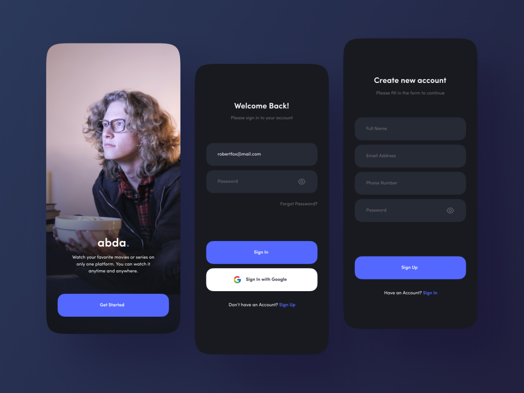
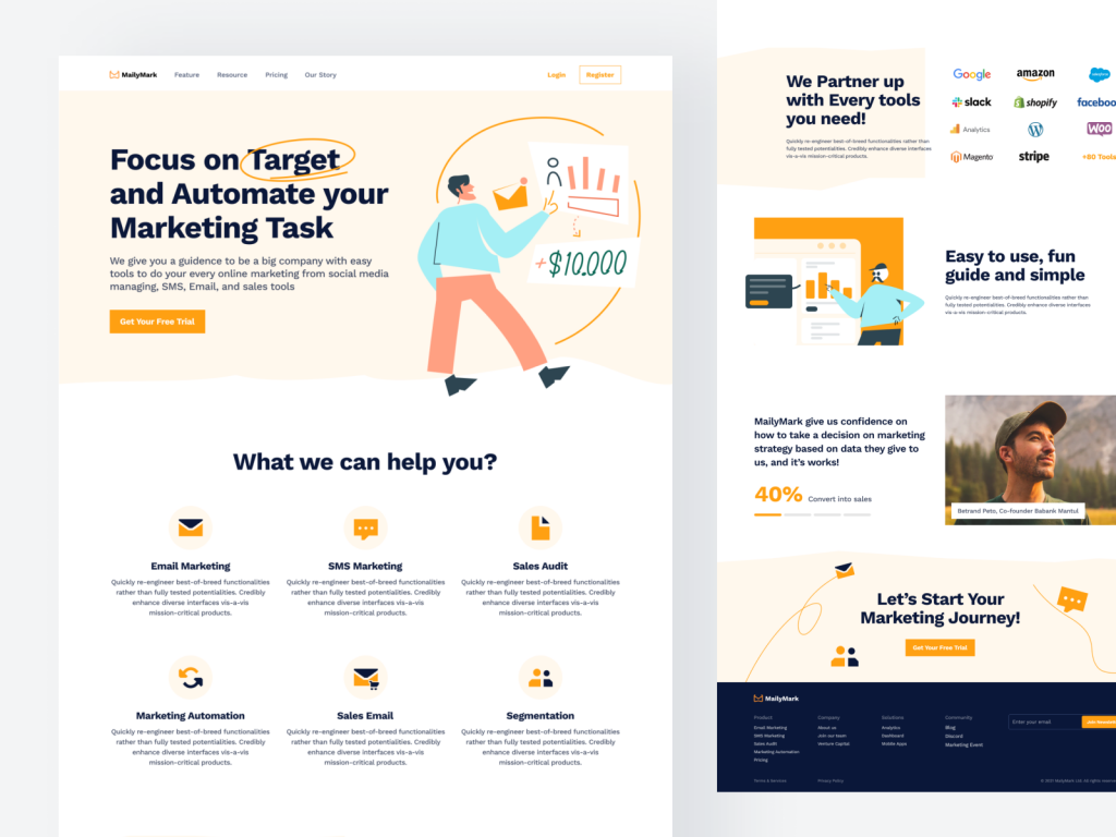
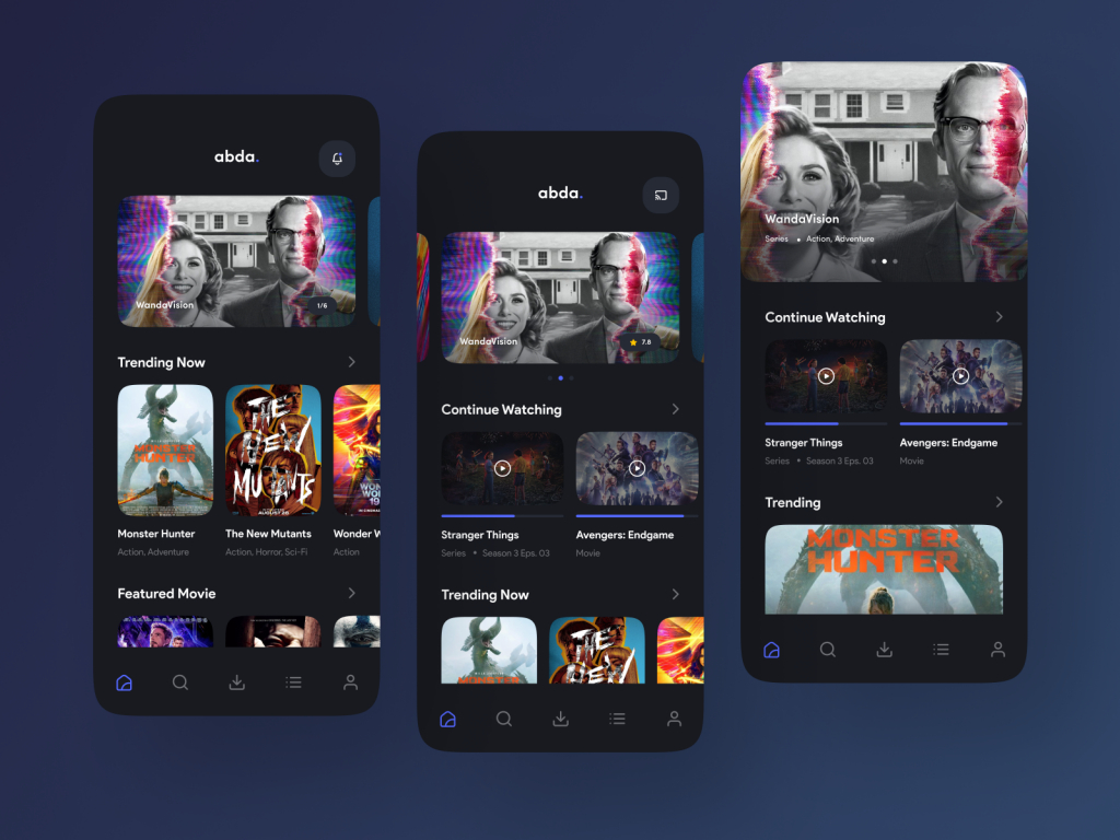
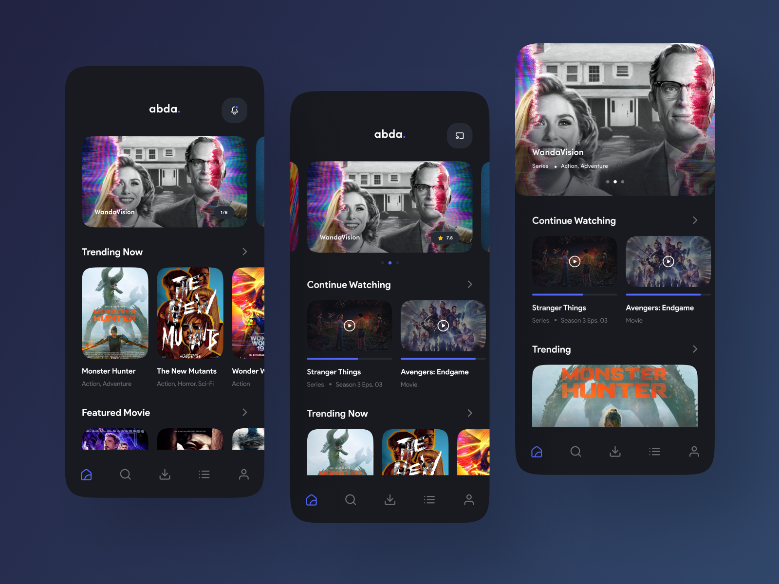
Abda’s dark design is more than a visual choice; it’s a deliberate decision to create an immersive cinematic experience. The dark backdrop serves as a canvas, allowing movie posters and thumbnails to pop with vibrant intensity. The subdued color palette puts the focus squarely on the content, enhancing the overall aesthetic appeal.

Seamless Movie Watching: A Click Away

One of the standout features of Abda’s dark design is its user-friendly interface for movie watching. Users can effortlessly navigate through their favorite movies, and with a simple click, seamlessly continue from where they left off. The dark background minimizes distractions, ensuring an uninterrupted and immersive movie-watching experience.

Trending Movies: Spotlight on Cinematic Brilliance

Abda’s dark design extends to its curated sections, with trending movies taking center stage. The dark backdrop serves as the perfect showcase for the latest and most popular films. Thumbnails and descriptions come to life against the dark canvas, creating a visually striking presentation that entices users to explore the cinematic gems.

Benefits of Dark Design: Beyond Aesthetics

The dark design of Abda goes beyond aesthetics; it offers practical benefits for users. The reduced screen brightness in dark mode is gentler on the eyes, especially during extended viewing sessions. Additionally, the dark theme enhances the visibility of text and images, ensuring that users can navigate effortlessly even in low-light conditions.

Night Mode for Cinematic Comfort

For those who enjoy movie marathons into the night, Abda’s introduces a night mode that enhances the cinematic comfort. The subdued hues contribute to a comfortable and enjoyable viewing experience, eliminating the strain on the eyes and allowing users to immerse themselves fully in the cinematic world.

Interested in creating a dark design with us? Contact us hello@keitoto.com 

 or visit our website Keitoto.com  now!

Photokno – Photography Service Landing Page

Photokno, a photography service with a mission to turn moments into lasting memories. Let’s embark on a journey to explore the intricacies of Photokno’s Photography Service Landing Page.

Welcome to Photokno: Where Every Click Unveils a Story

Upon arriving at the Photography Service Landing Page, visitors are greeted with a visually stunning display that encapsulates the essence of Photokno’s artistry. The page opens with a carefully curated selection of breathtaking photographs, offering a glimpse into the storytelling prowess that awaits potential clients.

Streamlined Navigation for Seamless Exploration

Photokno understands the importance of a user-friendly interface, and the landing page is a testament to that philosophy. From portfolio showcases to service offerings, every element is strategically placed, allowing users to explore without any navigational hiccups.

Photokno Portfolio Showcases: A Visual Symphony

Photokno’s Photography Service Landing Page is a portfolio showcase in itself.

Service Offerings: Crafting Tailored Experiences

As visitors delve deeper, they encounter a section dedicated to Photokno’s service offerings. From portrait sessions to event coverage and creative projects, each service is presented with clarity and accompanied by compelling visuals.

Photokno Client Testimonials: Building Trust Through Experience

The landing page strategically incorporates client testimonials, sharing firsthand experiences of those who have entrusted Photokno with their precious moments.

Call-to-Action: Turning Interest into Action

Photokno’s Photography Service Landing Page features a clear and inviting call-to-action, encouraging visitors to take the next step in their photography journey. Whether it’s scheduling a consultation, booking a session, or simply reaching out for more information, the call-to-action is strategically placed to turn interest into action seamlessly.

Photokno’s landing page invites you to step into the realm where moments become everlasting memories.

Interested in creating a landing design with us? Contact us hello@keitoto.com  or visit our website Keitoto.com  now!

Pudidi’s Project Management Messenger

Pudidi’s Project Management Messenger on the mobile version is a testament to the platform’s commitment to enhancing freelancer-client collaboration. It transforms conversations into dynamic hubs of creativity and productivity. With features designed for real-time collaboration, task integration, and a robust notification system, Pudidi ensures that freelancers can stay connected and in control, no matter where their freelancing journey takes themThis exploration focuses on the mobile version, specifically diving into the user experience during conversations.

A Messenger Tailored for Freelancers

Pudidi’s Project Management Messenger is more than just a chat interface; it’s a central hub where freelancers can seamlessly communicate with their clients, eliminating the need for scattered conversations across various platforms. Now, let’s delve into the mobile version, where the conversation comes to life on the go.

Mobile Conversations: Where Collaboration Thrives

Upon entering the mobile version, users are greeted with an interface designed for simplicity and efficiency. The conversation thread is prominently featured, allowing freelancers to stay connected with clients anytime, anywhere. The clean and intuitive design ensures that the focus remains on the exchange of ideas and project updates.

Real-Time Collaboration Features

What sets Pudidi’s Project Management Messenger apart is its array of real-time collaboration features. In the mobile version, freelancers can seamlessly share files, images, and project updates within the conversation thread. This fosters a dynamic and collaborative space where ideas can evolve and decisions can be made on the fly.

Task Integration for Seamless Workflow

Incorporating tasks directly within the conversation adds a layer of organization and efficiency. Freelancers can assign tasks, set deadlines, and track progress without leaving the Messenger. This integration ensures that the conversation remains action-oriented, promoting a fluid workflow.

Notification System: Staying in the Loop

Freelancers lead dynamic lives, and Pudidi’s mobile Messenger understands the importance of staying informed. The notification system is finely tuned, ensuring that freelancers receive timely updates, keeping them in the loop even when they are away from their desks.

Embrace the power of Pudidi’s mobile Messenger design , where conversations become the catalyst for unlimited possibilities in freelance collaboration.

Interested in creating a messenger design with us? Contact us hello@keitoto.com  or visit our website Keitoto.com  now!

Learning Platform App

In the digital age, where knowledge knows no boundaries, online learning platforms emerge as the catalysts for educational evolution. Imagine an app that seamlessly integrates video-based learning with real-time communication, connecting students with tutors and classmates. This is the future envisioned in the design of our groundbreaking Online Learning Platform App.

Learning Unleashed: Video-Based Education

At the core of our app’s design lies the belief in the power of visual learning. The app facilitates an immersive educational experience through video-based lessons. Students can access a rich repository of educational content, ranging from lectures and tutorials to interactive demonstrations, all delivered with clarity and engagement. This innovative approach ensures that learning becomes a dynamic and captivating journey.

Real-Time Interaction: Chatting with Tutors and Classmates

Education is not just about absorbing information; it’s about fostering connections and exchanging ideas. Our Online Learning Platform App introduces a robust real-time communication feature, allowing students to chat with tutors and classmates.

Intuitive User Interface for Seamless Navigation

Navigating the app is an intuitive experience designed with the user in mind. The clean and organized interface ensures that students can effortlessly switch between video lessons and chat functionalities. Main menu is thoughtfully structured, providing quick access to courses, discussions, and personal progress. The goal is to make the learning journey as smooth and enjoyable as possible.

Personalized Learning Paths

Recognizing that each student is unique, our app incorporates features for personalized learning paths. Students can set their pace, revisit lessons, and tailor their educational journey according to their individual needs. The app adapts to the user’s progress, offering recommendations for additional resources and challenges to enhance comprehension and mastery.

Multi-Device Accessibility

Understanding the diverse ways students access educational content, our app is designed to be accessible across multiple devices. Whether on a smartphone, tablet, or desktop, the seamless responsiveness of the design ensures a consistent and engaging learning experience. Education becomes truly mobile, allowing students to learn anytime, anywhere.

Interested in creating a mobile app design with us? Contact us hello@keitoto.com  or visit our website Keitoto.com  now!

SaaS Management Landing Pages – Pudidi Series

In the realm of SaaS management, Keitoto introduces a groundbreaking series of Pudidi landing pages, unveiling a clean and bold approach that revolutionizes the user experience.

Unveiling Pudidi: Empowering Freelancers

For those unfamiliar, Pudidi stands as a beacon in the realm of project management tools. Tailored for freelancers, it goes beyond conventional project management by assisting in creating contracts, proposals, sending invoices, and establishing a collaborative board to interact seamlessly with clients. Now, let’s delve into the heart of Pudidi’s evolution – its SaaS Management Landing Pages.

The Essence of Efficient SaaS Management

More than a series of landing pages, Pudidi’s SaaS Management pages are a gateway to efficiency and seamless project control. The clean and bold approach is not merely aesthetic; it’s a deliberate choice to enhance user navigation and engagement. Each element is thoughtfully designed to communicate the power of Pudidi in a glance.

A Visual Symphony of Clean Design

The exploration of website design for Pudidi’s SaaS Management tools takes center stage with a clean and bold aesthetic. Pudidi pages act as a visual symphony, guiding users through the intricacies of project management with a clarity that resonates. The clean design eliminates unnecessary clutter, focusing on essential features and functionalities.

Bold Features for Seamless Navigation

Pudidi’s SaaS Management Landing Pages showcase bold features that define the platform’s prowess. From creating contracts with a few clicks to sending invoices effortlessly, each feature is presented boldly, emphasizing the ease and efficiency that Pudidi brings to freelancers. The design invites users to explore, ensuring an intuitive journey through the capabilities of this dynamic project management tool.

Connecting the Dots: Exploration to Efficiency

The journey from project exploration to efficient management is seamlessly connected through Pudidi’s SaaS Management Landing Pages. Users are guided through a narrative that highlights not just the features but the transformative power of efficient project management. The clean design and bold features serve as a testament to Pudidi’s commitment to empowering freelancers.

Pudidi’s SaaS Management Landing Pages redefine the landscape of project management for freelancers. It’s not just a series of pages; it’s a visual and experiential exploration that leads users to the core of efficiency.

Want to collaborate? Email Us: hello@keitoto.com

or visit our website Keitoto.com now!

Web Landing Page Animation for uStock

Web Landing Page Animation is a new concept that not only captivates but elevates the user experience for u Stock an unique investment app.

Unveiling uStock: The Investment Revolution

For those unfamiliar, uStock stands as a beacon of innovation in the realm of personal finance. It is not just an investment app; it is a personalized venture, crafted for individual projects and financial aspirations. The introduction of the new Landing Page Animation marks a significant leap forward in uStock’s commitment to providing an unparalleled user experience.

Web Landing Page Animation Essence

The Landing Page Animation for uStock serves as a visual symphony that greets users upon arrival. It transcends the traditional static landing page, offering a dynamic and immersive introduction to the world of uStock.

Web Landing Page Animation An Engaging Narrative Unfolds

As visitors explore the landing page, they are greeted with a captivating narrative that unfolds seamlessly through animation. From the evolution of investment trends to the empowering features of uStock, the animation acts as a virtual tour guide, introducing users to the app’s capabilities and guiding them through the user-friendly interface.

Interactive Features and Functionality

The Landing page Animation goes beyond aesthetics; it integrates interactive features that engage users. Animated infographics showcase real-time investment data, providing a dynamic snapshot of uStock’s performance. Users can interact with elements, gaining a hands-on understanding of how uStock transforms personal financial management.

Web Landing Page Animation Elevating User Understanding

The animation serves a dual purpose – not only does it captivate the audience, but it also enhances user understanding. Complex concepts like portfolio diversification, investment tracking, and financial goal setting are brought to life through dynamic visuals, making uStock’s value proposition clear and accessible.

Conclusion: A New Chapter in uStock’s Story

Embark on the next chapter of uStock’s story and experience the investment revolution through the dynamic lens of the animation. Dive into the future of personal finance, where innovation meets immersion, and the journey to financial success is brought to life.

Prove it with Keitoto.com

Pudidi – Schedule Project Dashboard

Pudidi, an innovative project management tool design, emerges as a game-changer for freelancers seeking seamless control over their projects. One of its standout features is the meticulously designed Schedule Project Dashboard, a hub that empowers freelancers to master their schedules with unparalleled ease.

Pudidi Essence for Schedule Project Dashboard

Pudidi is not merely a project management tool; it’s a comprehensive platform designed with freelancers in mind. The Schedule Project Dashboard is a testament to the platform’s commitment to simplifying the freelance journey. It serves as a centralized space where freelancers can orchestrate and monitor their project schedules effortlessly.

Navigating the Team Schedule Pages

The heart of the Schedule Project Dashboard lies in its Team Schedule Pages. This feature is a dedicated space where freelancers can coordinate with their team, ensuring everyone is on the same page regarding project timelines, milestones, and deadlines. The intuitive design of these pages makes collaboration seamless, fostering a sense of unity among team members.

Pudidi Effortless Scheduling for Freelancers

Freelancers often wear multiple hats, juggling various projects simultaneously. Pudidi’s Schedule Project Dashboard offers a user-friendly scheduling system that allows freelancers to allocate time efficiently. From project kickoff to delivery, freelancers can easily set milestones, track progress, and ensure deadlines are met, all within a few clicks.

Bridging Communication Gaps

Effective communication is the backbone of successful project management. Pudidi’s Team Schedule Pages provide a platform for freelancers and their teams to communicate seamlessly. Comments, updates, and notifications are integrated, facilitating real-time discussions and minimizing the risk of miscommunication.

Unleashing Potential with Pudidi

Pudidi’s Schedule Project Dashboard is more than a scheduling tool; it’s a catalyst for freelance success. By centralizing project schedules, enhancing team collaboration, and providing a user-friendly scheduling interface, Pudidi empowers freelancers to take control of their projects and elevate their professional journey.

Embrace the power Schedule Project Dashboard design like Pudidi and embark on a journey where project management becomes a streamlined, collaborative, and ultimately rewarding experience.

Interested in creating a dashboard design with us? Contact us hello@keitoto.com  or visit our website Keitoto.com now!

Hotel Booking App Design

Hotel Booking App Design

Step into a world of seamless travel experiences with our cutting-edge Hotel Booking App design. Our user-centric interface and intuitive features redefine the way you plan and book your accommodations. Discover a sleek and visually appealing design that enhances your booking journey, providing a delightful and efficient user experience booking app now make a difference, Imagine a mobile-first design that not only simplifies the booking process but enhances the overall travel experience. Let’s explore the key features that set apart a cutting-edge hotel booking app designed with a focus on mobile accessibility.

Hotel Booking App Design Seamless Mobile Experience

At the heart of this hotel booking app lies a mobile-first design philosophy. From the moment users open the app, they are greeted with an interface meticulously crafted for the smaller screens of smartphones. The layout is intuitive, ensuring a seamless experience for users on the go.

Hotel Booking App Design Intelligent Filtering for Personalized Choices

The app’s filtering system is a game-changer. Users can effortlessly narrow down their search by property type and price range, allowing for a personalized and efficient browsing experience.

Calendar Booking for Effortless Planning

The inclusion of a calendar booking feature elevates the convenience of planning a trip. Users can easily select their check-in and check-out dates, visualize room availability, and plan their stay with just a few taps. This intuitive calendar system simplifies the booking process, providing users with a clear overview of their travel itinerary.

Navigating with Precision: Maps Feature

The app integrates a dynamic maps feature that empowers users to make informed decisions about their stay. The maps feature not only aids in decision-making but also enhances the overall travel planning experience.

Embrace the future of travel with an app designed to make every stay a memorable experience. Plan your mobile app design with Keitoto.com

Want to collaborate? Email Us: hello@keitoto.com

or visit our web Keitoto Portfolio Keitoto

Email Marketing Website – MailyMark

Elevate Your Marketing Game with a Palette of Warmth and Reliability

In the dynamic realm of digital marketing, the right tools can make all the difference. Imagine navigating through a marketing tools website where every click resonates with warmth and reliability. Welcome to a transformative experience where soft colors play a pivotal role in enhancing user engagement and fostering a sense of trust.

Embracing Soft Hues for a Welcoming Aura

The journey begins with the careful selection of soft colors that go beyond aesthetics. Soft blues, gentle greens, and muted purples create an inviting aura, welcoming visitors with open arms. These tones evoke feelings of tranquility, reliability, and approachability, setting the stage for a positive user experience.

Navigating the Interface: A Harmonious Symphony

As users traverse the website, the soft color palette seamlessly integrates with the interface, creating a harmonious symphony of design elements. Soft hues act as a guide, directing attention to key features and functionalities. The user is effortlessly led through a journey that feels not just navigable but enjoyable.

Building Trust through Design

In the world of marketing tools, trust is paramount. Soft colors contribute to an atmosphere of reliability and professionalism. Visitors subconsciously associate the inviting hues with a trustworthy brand, fostering confidence in the tools and services offered. This subtle yet powerful connection builds a foundation of trust that resonates with potential users.

Soft Color Psychology: A Strategic Approach

The use of soft colors extends beyond aesthetics; it’s a strategic approach rooted in color psychology. Soft hues are known to evoke positive emotions and create a sense of calm. By strategically incorporating these tones into the website design, marketers tap into the psychology of perception, ensuring that visitors feel at ease and receptive to the marketing tools presented.

Embrace the power of soft colors and elevate your marketing endeavors with a website that not only functions flawlessly but also radiates warmth and reliability.

Want to collaborate? Email Us: hello@keitoto.com

 or visit our website Keitoto.com now!