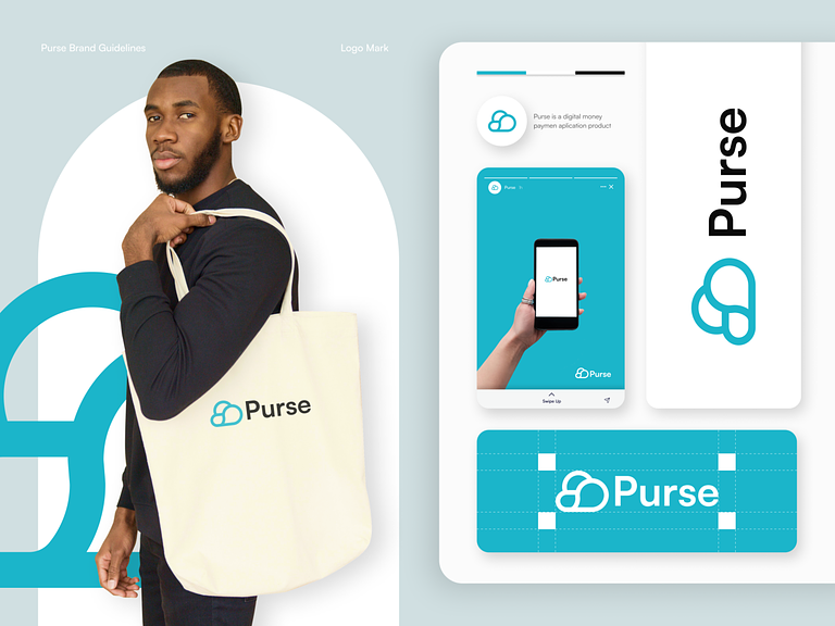
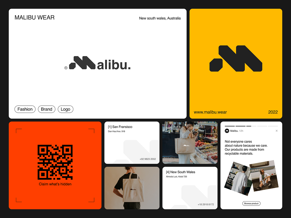
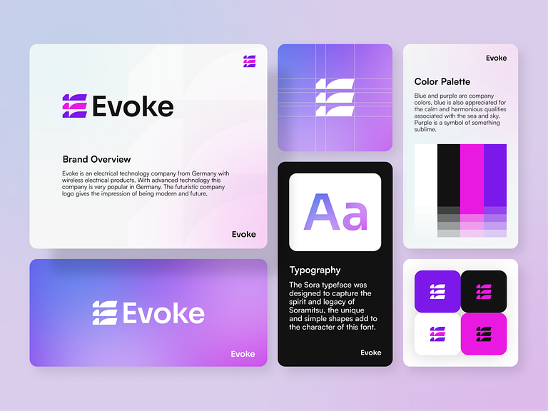
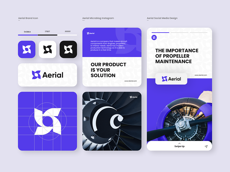
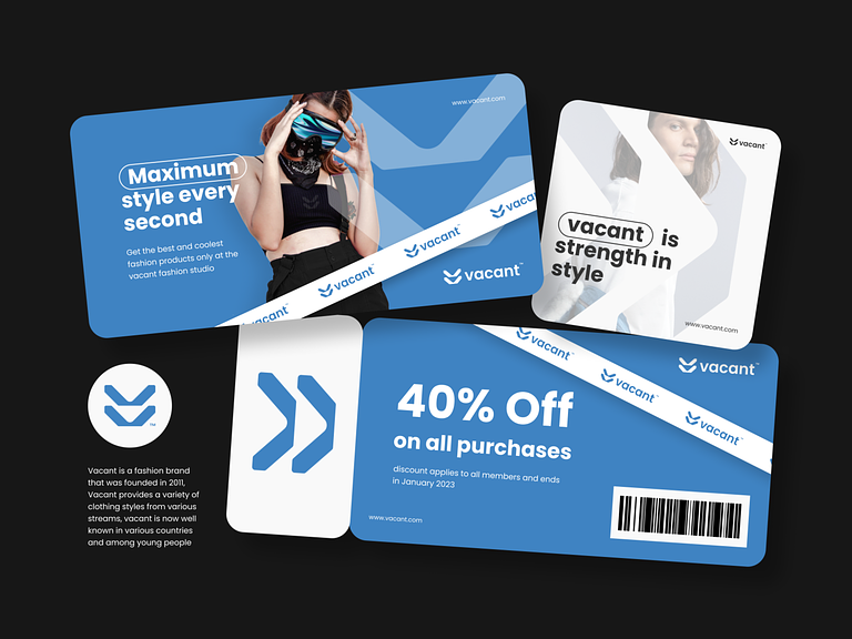
Malibu – Fashion Logo Branding

Malibu - Fashion Logo Branding

Malibu – Fashion Logo Branding

Malibu – Fashion Logo Branding

In the realm of fashion branding, Malibu stands out as an epitome of elegance, sophistication, and style. Crafted with meticulous attention to detail, the Malibu logo encapsulates the essence of luxury and allure, making it a timeless symbol of fashion excellence.

πŸ‘— Icon Design

At the heart of the Malibu logo is an iconic symbol that embodies the spirit of haute couture. The design may feature elements such as a stylized letter “M,” a sleek silhouette, or an abstract motif inspired by the waves of the ocean. Whatever the design, it exudes a sense of grace and refinement, reflecting the brand’s commitment to quality and craftsmanship.

🎨 Color Palette

The color palette of the Malibu logo is carefully curated to evoke a sense of glamour and sophistication. Shades of deep navy, opulent gold, and luxurious silver are often used to convey elegance and prestige. These colors not only elevate the brand’s aesthetic appeal but also evoke a sense of exclusivity and allure.

✨ Typography

Typography plays a crucial role in conveying the brand’s identity and personality. The font chosen for the Malibu logo may be sleek and modern, exuding a sense of contemporary chic, or it may be more ornate and decorative, reminiscent of classic haute couture. Whatever the choice, the typography reflects the brand’s commitment to excellence and attention to detail.

πŸ’Ό Brand Consistency

Consistency is key to successful branding, and the Malibu logo is no exception. Whether it’s displayed on clothing tags, product packaging, or advertising materials, the logo maintains its integrity and allure, ensuring instant recognition and association with the brand’s values and ethos.

🌟 Conclusion

The Malibu logo is more than just a symbol; it’s a statement of style, sophistication, and luxury. With its iconic design, carefully curated color palette, and impeccable typography, the Malibu logo captures the essence of fashion excellence and sets the brand apart as a beacon of glamour and allure in the world of haute couture.

User

You

Malibu – Fashion Logo BrandingChatGPT

ChatGPT

Malibu – Fashion Logo Branding

In the world of fashion, branding is paramount, and Malibu sets a high standard with its logo design. Reflecting the essence of luxury and style, the Malibu logo is an iconic representation of sophistication and elegance.

πŸ‘— Icon Design

The Malibu logo features a distinctive icon that embodies the brand’s identity. It might incorporate elements like waves, palm trees, or other coastal imagery, capturing the essence of the Malibu lifestyle. This icon serves as a visual anchor, instantly recognizable and synonymous with the brand’s values of beauty and luxury.

🎨 Color Palette

Drawing inspiration from the sun-kissed beaches of Malibu, the color palette of the logo exudes warmth and vibrancy. Soft hues of blue and turquoise evoke the tranquil waters of the Pacific Ocean, while golden tones reflect the warm glow of the California sun. Together, these colors create a sense of luxury and sophistication that is synonymous with the Malibu brand.

✨ Typography

The typography chosen for the Malibu logo is sleek and modern, yet with a touch of refinement. Clean lines and elegant curves convey a sense of sophistication, while the choice of font adds a contemporary edge. The typography seamlessly integrates with the icon, creating a cohesive and visually appealing logo that captures the brand’s essence.

πŸ’Ό Brand Consistency

Consistency is key to effective branding, and the Malibu logo maintains a strong presence across all brand touchpoints. Whether it’s on clothing labels, product packaging, or advertising materials, the logo remains consistent in its design and execution. This ensures instant recognition and reinforces the brand’s identity in the minds of consumers.

🌟 Conclusion

The Malibu logo is more than just a visual representation of the brand; it’s a symbol of luxury, style, and sophistication. With its iconic design, carefully chosen color palette, and sleek typography, the Malibu logo embodies the essence of the brand and sets the standard for fashion branding in the industry.

β€” β€” β€” β€” β€” β€” β€” β€” β€” β€”

Want to collaborate? Email Us: work@keitoto.com

Keitoto | Behance | Instagram | UI8 | Dribbble | Pinterest

Sturdy – Social Media Design

Sturdy - Social Media Design

Sturdy – Social Media Design

Sturdy – Social Media Design

In the realm of digital connectivity, Sturdy Social Media Design offers a robust platform for users to engage, connect, and share their experiences with others. Meticulously crafted with user experience in mind, Sturdy provides a sturdy foundation for social interaction, fostering meaningful connections and vibrant communities.

🌐 User-Friendly Interface
At the heart of Sturdy is its user-friendly interface, designed to provide seamless navigation and effortless interaction. Users are greeted with a clean and intuitive layout, making it easy to browse through content, engage with posts, and connect with friends and followers.

πŸ“Έ Visual Appeal
Sturdy prioritizes visual appeal, with emphasis on high-quality images and captivating graphics. From stunning photo galleries to eye-catching multimedia content, users can showcase their creativity and express themselves in visually compelling ways.

πŸ‘₯ Community Building
Sturdy facilitates community building through features such as groups, events, and discussions. Users can join communities based on shared interests, connect with like-minded individuals, and participate in meaningful conversations on a wide range of topics.

πŸ”’ Privacy and Security
Privacy and security are paramount on Sturdy, with robust measures in place to protect user data and ensure a safe online environment. Users have control over their privacy settings, allowing them to customize their sharing preferences and manage their online presence with confidence.

πŸ“± Cross-Platform Compatibility
Sturdy is accessible across multiple devices and platforms, including desktops, laptops, smartphones, and tablets. Whether users are at home or on the go, they can easily access Sturdy and stay connected with their social network at all times.

🌟 Conclusion
Sturdy Social Media Design offers a reliable and immersive platform for users to connect, share, and engage with others in a meaningful way. With its user-friendly interface, visual appeal, community-building features, and commitment to privacy and security, Sturdy provides users with a solid foundation for building and nurturing their online social networks.

β€” β€” β€” β€” β€” β€” β€” β€” β€” β€”

Want to collaborate? Email Us: work@keitoto.com

Keitoto | Behance | Instagram | UI8 | Dribbble | Pinterest

Evoke – Electrical Technology Company Logo Branding

Evoke - Electrical Technology Company Logo Branding

Evoke – Electrical Technology Company Logo Branding

⚑ Evoke – Electrical Technology Company Logo Branding ⚑

Embark on a journey into the realm of innovation and energy with Evoke, an Electrical Technology Company that redefines the visual language of its brand through distinctive Logo Branding. The logo encapsulates the essence of electrical prowess, technological advancement, and a forward-thinking approach. Let’s explore the key design elements that make Evoke’s logo a symbol of power and sophistication.

βš™οΈ Symbolic Icon – The Power of Innovation

Evoke’s logo features a symbolic icon at its core, representing the dynamic force of innovation in the electrical technology sector. The icon may take the form of a stylized electrical circuit, a lightning bolt, or a fusion of elements that convey the company’s cutting-edge solutions.

🌐 Technological Aesthetics – Modern and Sleek

The aesthetics of the logo exude modernity and sleek design. Clean lines, smooth curves, and a minimalist approach contribute to a visual identity that aligns with Evoke’s commitment to state-of-the-art electrical technology.

🎨 Color Palette – Electrifying Tones

The color palette of Evoke’s logo is carefully chosen to evoke a sense of energy and sophistication. Electrifying tones such as vibrant blues, dynamic greens, or sleek metallic hues are employed to symbolize power, trust, and technological excellence.

πŸ” Typography – Futuristic Font Selection

The typography complements the logo’s modern aesthetics with a futuristic font selection. Bold and streamlined lettering reinforces the brand’s identity as a leader in the electrical technology landscape, projecting confidence and innovation.

🧲 Integration of Symbolism – Connectivity and Progress

Evoke’s logo may incorporate symbolism that reflects the connectivity and progress facilitated by electrical technology. This could involve intertwining lines, arcs, or circles to signify the interconnected nature of Evoke’s solutions and their role in advancing technological frontiers.

🌟 Dynamic Motion – Implying Energy in Action

For a touch of dynamism, the logo may introduce elements that imply motion or energy in action. This could be achieved through subtle gradients, shading, or the strategic placement of lines, creating a sense of movement and vitality.

🌍 Versatility – Scalability and Application

Evoke’s logo is designed with versatility in mind. Whether displayed on a business card, website, or a large-scale banner, the logo maintains its clarity and impact. Scalability ensures that the brand’s visual identity remains effective across diverse applications.

πŸ’‘ Illumination Effects – Symbolizing Enlightenment

Incorporating subtle illumination effects within the logo can symbolize enlightenment, aligning with Evoke’s role in providing illuminating solutions in the electrical technology sector. These effects add depth and sophistication to the overall design.

πŸ”„ Timeless Design – Enduring Appeal

The logo for Evoke is crafted with a timeless design that ensures enduring appeal. Balancing contemporary aesthetics with enduring elements, the logo stands the test of time, projecting a sense of longevity and stability in the ever-evolving tech landscape.

πŸš€ Conclusion – Evoke’s Logo: Powering the Future

In conclusion, Evoke’s Electrical Technology Company Logo Branding is a visual powerhouse that encapsulates the brand’s commitment to innovation, energy, and technological advancement. With a symbolic icon, modern aesthetics, electrifying colors, futuristic typography, integrated symbolism, dynamic motion, versatility, illumination effects, and timeless design, Evoke’s logo stands as a beacon in the electrical technology sector, ready to power the future with brilliance and innovation. ⚑🌐✨

β€” β€” β€” β€” β€” β€” β€” β€” β€” β€”

Want to collaborate? Email Us: hello@keitoto.com

Keitoto | Behance | Instagram | UI8 | Dribbble | Pinterest